
Figures 1 and 2 are examples of getting stuck trying to fix your current business when instead you ought to throw your troubles away and build a better business system.
This business is a renowned company in its home country. It is well respected and profitable enough. But it could easily be much wealthier. There are vast new fortunes sitting in the business, but they will never be seen by its owners and managers. They are totally focused each day on trying to make the existing business processes and system work properly. In reality, their operational processes need to be redesigned to remove the problems stopping them from delivering the organization’s purpose.
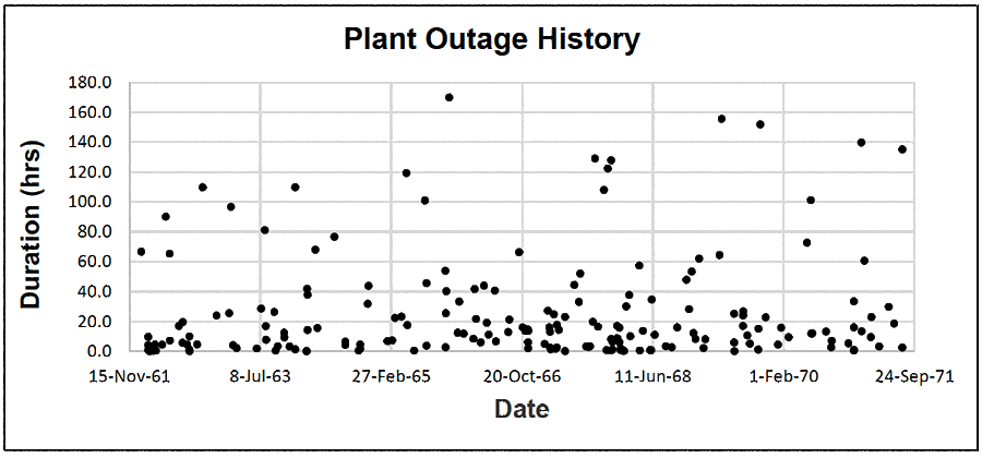
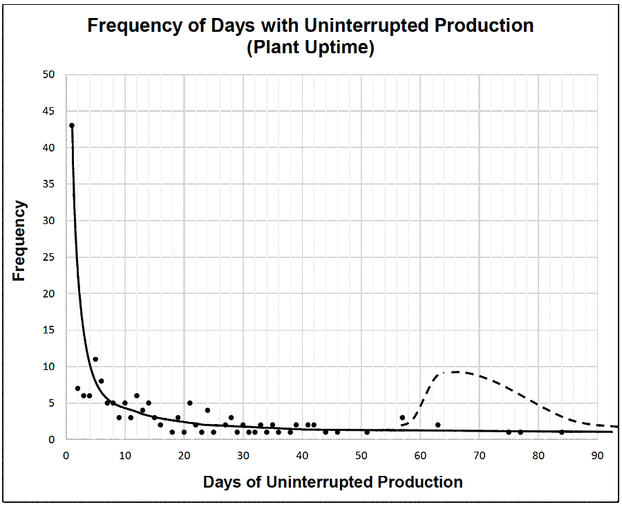
The two charts cover a period of 10 years of operation (the years and company are intentionally disguised). Figure 1 is a run chart showing the dates and durations of all outages. The periods between downtimes are the operation’s uptime. Figure 2 is the uptime frequency distribution curve derived from the run chart. It is a “chance of success” chart because it shows how often each uptime period happened during the 10 years. The shape of the frequency distribution curve foretells what outcomes can be expected in the future.
Look at the density of outages in the run chart. There were years of frequent trouble and times of less. Things must have gone bad often to create the dense regions. The last two years show fewer minor trips and some of the best uptimes. Note the stratification of dots: many less than 50 hours of outage and far fewer greater than that. Having random outages of 10- to 48-duration is common in this operation.
The frequency distribution curve turns the splatter of events in the run chart into a clear message about this company’s chance of uptime success. There are dozens of short-duration running periods of less than 2 days and quite a few periods from 2 to 10 days. Very few uptime periods last longer than 20 days. The story hidden in the run chart becomes obvious in the frequency distribution plot: this business is missing out on a fortune in operating profits (worth several million dollars annually) because it has so many stoppages interrupting production. Yet, the same operation has several times delivered over two months of uninterrupted production. The process design can get long production runs, but things happen in the organization to prevent success.
The whole area under the curve in the frequency distribution is the probability of plant uptime. You can estimate by eye that the area between 0 and 20 days is larger than the area from 20 to 80 days by about four times. It is four times more likely that the next plant outage will be fewer than 20 days away than it will be more than 20. It looks about three times more likely that an outage will happen in fewer than 10 days rather than longer. It is clear from the “hump” in the curve between 0 to 2 days that short duration outages are a regular problem for the business. It would be very valuable to analyze the reasons for the outages in the hump to learn what causes are producing so many stoppages and eliminate them so the process can work to its best design performance.
The shape of the uptime frequency distribution curve contains information about the business process design. The clustering of results along a negative downward curve tells us there are destructive influences at work within this company.
This company has an in-built outage-causing process—surely unintentionally introduced—that is producing the poor uptime results. The early failure peak is an indicator of poor business process quality control—there are a lot of defects sitting in the business waiting for the chance to go wrong. The negative slope at the back of the curve means that the company’s current designed and intended processes can never get it to the production performance it wants, which is 60 days or more of uninterrupted production uptime between outages (the dashed curve in Figure 2). That has happened only five times in 10 years.
Those five successes were all attributable to luck. We know it was luck, because the long duration uptime points form a flat line, meaning that they were accidental results without consistency. Those 50-day or longer uptimes were chance events; they are not repeatable by intention because of the self-destroying influences within the company processes. The only sure thing in this business is that uptime has a great chance of being fewer than 20 days and some chance of being up to 30 days; the company will be incredibly lucky if it gets the 60 days it wants (about a 10% chance).
Their maintenance costs must be higher and their availability lower because of the many unwanted outages that do not need to happen. The engineering, maintenance, and operational processes this business uses can only deliver the current uptime results seen in the plots. Remember, this is 10 years of real production data—this performance is what actually results. Until the company adopts reliability creation processes that guarantee the success it wants, future operating performance and losses will be the same as in the past.
Make use of plant run charts. They are more than simply indicators of the dates when you had problems in your plant or with your equipment. They contain knowledge of the likely behaviour of your operation in the future. That behaviour is the result of the cumulative effects of your capital projects, asset management, operational, and maintenance management policies and practices. Once you convert run chart data into a frequency distribution, you see the natural behaviour of your operation and its processes.
To do useful process improvement, it is vital to know the reason for each data point. A run chart of each type of event cause is then plotted, and the cause frequency distribution is graphed as in Figure 3. Using the distribution curve of causes lets you identify the frequency of each event cause. If you then plot the cumulative costs and lost profits from each event, you will understand the high cost problems you have in your company. Repeating causes are likely to be indications of common cause problems in your operation. Single events may indicate a special cause impacting the process. If the same cause reoccurs, the business-wide losses from it will justify starting an improvement project to solve the problem. Once the problem is removed, the money once lost will turn into new operating profits. Keep full and complete records of your production and maintenance problems—they are worth solid gold to you in the future.
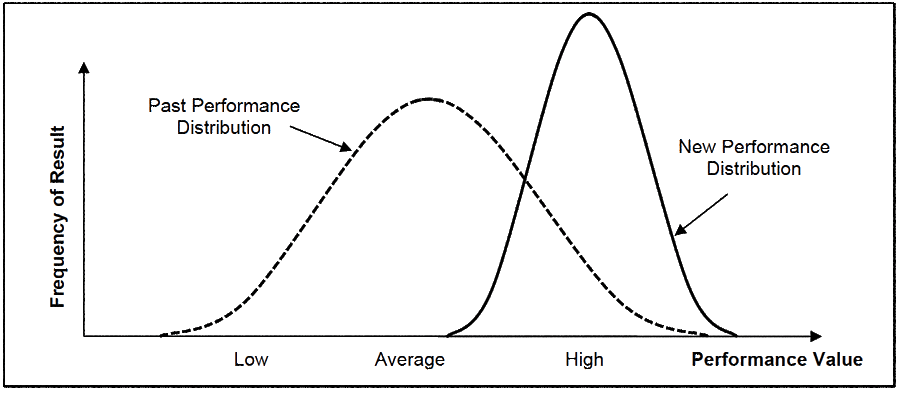
With distribution curves, you have a means to monitor the effectiveness of changes made to a process. Each change you introduce will produce a new performance result for the steps you alter and cumulatively for the process. Once you collect about 10 to 12 results, superimpose the curve for the new outcomes on the past distribution curve to get feedback on the impact of the change. If the new curve does not plot within the higher performance part of the old curve, you need to keep looking for better answers.
Mike Sondalini

Leave a Reply