A good plot reveals the data’s story.
Repairable system data is what is called by statisticians a renewal process.
The repair activity may restore the system to as good as new. Sometimes, the repair pretty much leaves the system in a state similar to just before the repair.
What happens most often, though, is the chance of system failure changes after each repair activity.
A simple plot can help us see what is happening.
Three data sets of collected time of repair data
Let’s say we have three assets on the shop floor that have been running for about 1,000 hours each.
Each has experienced 10 failures requiring repair. The repair time is typically less than an hour (keeping repair time short compared to run time to keep the analysis simple.)
Machine 1 experienced the failures at the following hours of operation:
112
615
198
692
301
820
425
907
509
989
The times are in hours since the equipment was installed.
The first failures occurred at 112 hours after installation. The second occurred 198 hours after installation, and so on.
Machine 2 experienced the failures at the following hours of operation:
112
760
293
813
480
849
560
898
702
920
Machine 3 experienced the failures at the following hours of operation:
112
350
142
424
191
563
230
710
280
879
Given this data what would you typically do to glean a better understanding of your equipment?
A simple dot plot view
One way to view the data is with a one-dimensional plot. The dot plot provides the location of each failure along the timeline. Here is machine 1’s dot plot:
Plus the plots for machines 2 and 3:

This provides a little more visibility over the table of numbers.
Machine 1 seems to have evenly spaced failures. Machine 2 has more failures as the equipment ages (like my car did when I was in high school).
And Machine 3 seems to be running longer between failures as it ages.
Looking for curves with cumulative plots
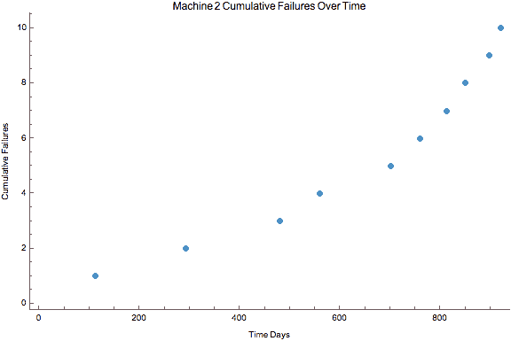
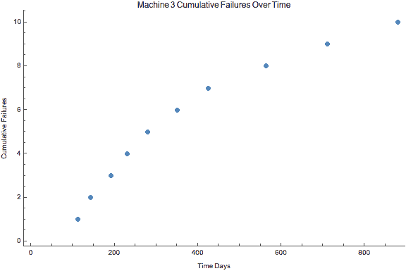
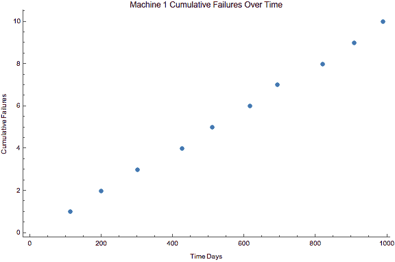
Another way to plot the data instead of marking when a failure occurs, plot the cumulative failures against time. The y-axis becomes the count of failures.
Here are the three plots:
The relatively straight line in the plot confirms our hunch that the failures are occurring at regular intervals.
The repair activities are not improving nor degrading the equipment over time.

Machine 2 has an upward bow the data over time.
The decrease in time between failures causes the data to show an increase in slope over time.
This suggests either more elements of the system are failing, or the repair work is degrading the equipment’s reliability over time.

Machine 3 has a slight bending over from steep to getting flatter over time.
Here the machine experienced more failures early and over time has longer periods of time between failures.
It is either over the early life period of issues, or the repair work is actually improving the equipment’s reliability.
The three example data sets are contrived, yet illustrate the power of plotting cumulative failures over cumulative time. An easy plot to see what is happening with your equipment over time.
You should have numerous questions based on each plot.
- What is causing the particular pattern?
- What can we do to improve the equipment?
- Have the types of failures changed over time?
Asking better questions is an essential part of understanding your data.
A simple plot or two can help you ask better questions, and uncover the story your data is trying to tell you.
Related:
Field Data and Reliability (article)
Failure Analysis: The Key to Learning from Failure (article)
The Next Step in Your Data Analysis (article)


 Ask a question or send along a comment.
Please login to view and use the contact form.
Leave a Reply