Measles Chart Basics
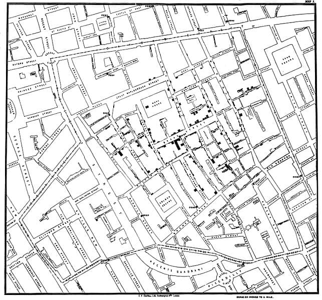
The clever Dr. John Snow mapped cholera cases during the epidemic of 1854 on a street map of the area. This type of mapping now called a measles chart, or defect location check sheet, or defect map, is useful when exploring the effect of location data.
The name measles chart may have come from the habit of using an image of drawing of a product and adding small red dots to signify defect locations.
Benefits of Measles Charts
There are different types of data including continuous, attribute, and location. While it is often a best practice to use continuous data whenever possible, converting locations data to continuous may lose useful information.
The benefit is we can map the location on a two-dimensional image or drawing, or we can (if clever) plot in three dimensions. The idea is to look for clusters patterns, much as Dr Snow is in the mid-1800’s/
Plotting the location of failed bearings along a conveyer belt system may reveal areas with a misalignment thus increase load or stress on the bearings. Plotting the location of solder joint defects or failed components may reveal an unwanted heat flow across the circuit board.
In short, the benefit if this charting method is the ability to see the data, the location data. It is especially useful when exploring the dataset along with time to failure, failure rates, etc.
Constructing a Measles Chart
Here is the original map by Dr. Snow.

The steps to construct such a map is pretty simple.
- Gather the location data or identify a stream of location data to analyze
- Find or create an image or map (sometimes a cross-section or exploded view drawing is useful)
- Draw a red dot (use a high contrasting color so the data is visible)
- For repeating defects at one location, use a stack of dots or similar means to convey multiple defects for one location.
- Consider the local environment and use conditions that may explain any patterns or clustering, along with other failure analysis techniques during the map analysis.
Keep it simple. This is a quick tool that may provide just the insight you need to solve a problem or understand improvement opportunities.
Summary
A simple charting tool for your toolkit. Consider creating a measles chart when you have location data. It’s quick and often provides just the view of the data that leads to insights otherwise hidden in the data.
Give it a try and let us know how it goes in the comments below.
 Ask a question or send along a comment.
Please login to view and use the contact form.
Leave a Reply