
Telematics data analysis can be used to improve our understanding of how people use their vehicles. It is an objective source to validate product requirements. In cars and trucks, sensor signals are read by electronic modules share the data on a CAN bus. Some signals contain data for continuous variables. Some examples of continuous variables are vehicle speed, engine speed, engine torque, ambient temperatures, in-vehicle temperatures, pressures, voltages, and the battery state of charge. Another name for the continuous variables is parametric data. This CAN data is a rich source of information
Traditional Engineering Analysis
If the time series of measurements is complete, then engineering may model single or multiple variables to calculate parameters of interest, for example, the cumulative damage on a part. However, since telematics data is intermittent, alternative methods are needed to characterize customer usages.
Statistical Analysis
One approach is to treat the data as a random sample. Numerical analysis can provide the sample average, standard deviation, and data extreme values. This provides information about the central tendency and variance of the data.
Once the average and standard deviation are calculated, it is tempting to make usage projections based on the normal distribution. But, it needs to be verified that the data is normally distributed or if another distribution is better to use. Using the wrong distribution leads to unrealistic projections of the percentiles in the tails of the distribution.
Engineers will often plot data as a histogram. The histogram will show if the data displays the typical bell shape of normally distributed data. Non-normally distributed data will show different patterns like multiple peaks, skewed high or low, or being flatter or more peaked.
There are several difficulties with the histogram. First, the data is grouped into rather broad measurement intervals. The shape of the histogram can change depending on how the intervals are defined and the quantity of data. A way to get around these limitations is to use probability plots to determine the best-fit distribution.
Engine Speed Example
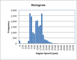
Consider a relatively small data set of engine speed data collected at 1 reading per second, for a vehicle, identified as VIN1, figure 1:
Figure 1
The engine speed histogram does not show the typical bell curve typical of a normal distribution. It is multi-modal and right skewed. Any analysis that assumed a normal distribution would be incorrect. A probability plot will not shown here as it is not required for the analysis that I am recommending.
Multiple Vehicles
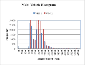
When multiple vehicles are compared, the frequency histogram is becomes more difficult to interpret. Two different vehicles are shown in figure 2.
Figure 2
The histograms show the bulk of the engine speed data for both vehicles are between 550 and 3,000 rpm, but it is difficult to determine if the vehicle usage patterns are different. An alternative is to use a cumulative histogram plot to display the data, figure 3.
Figure 3
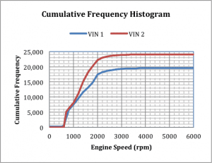
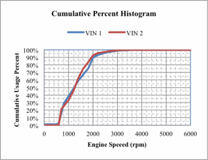
Now it is obvious that the two vehicles have different total usage. VIN1 had 19,500 data points and VIN2, 24,000 data points. To compare different vehicles with different total usage, the data needs to be standardized. Consider using the Cumulative Percentile Histogram, figure 4.
Figure 4
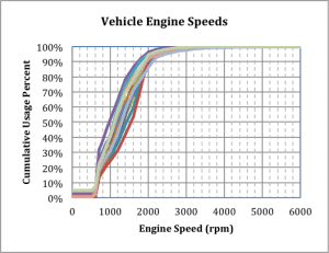
This shows that the two vehicle speed-cumulative usage percentile traces are similar. This approach was extended to a fleet containing 15 vehicles, figure 5.
Figure 5
Again, the 15 vehicles usages patterns are similar, but 15 overlaying traces increases the complexity of the graph.
Complexity Reduction
To reduce complexity, the multiple traces are collapsed to a central and high and low extreme percentile traces. Consider the value of the cumulative usage percentiles at 2000 rpm, table 1.
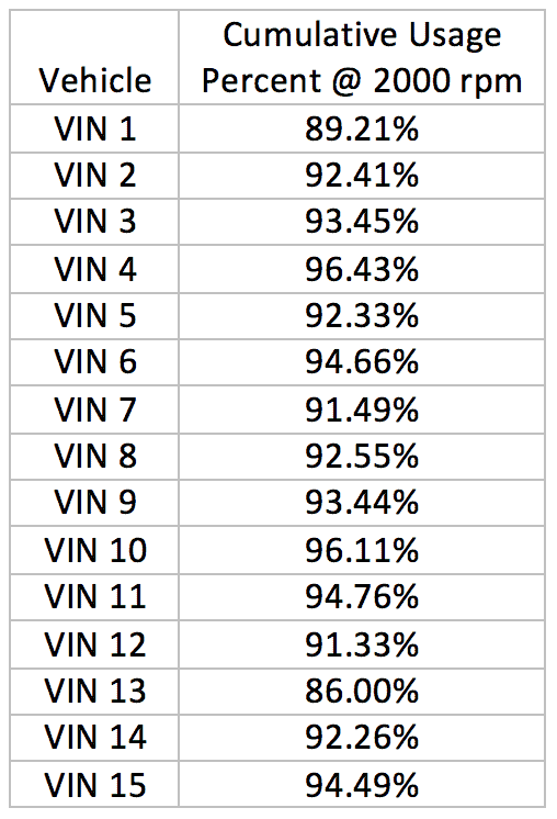
Table 1
In table 1, the values in the second column are the percentages each vehicle’s total usage. The data was sorted from lowest to highest and a vehicle number, starting from 1, was assigned percent usage. For example, the engine for vehicle 1 (VIN1) spent 89.21% of the time below 2000 rpm, or alternatively, 10.79%, time above 2000 rpm. VIN15 spent 94.49% of the time below 2000 rpm and 5.51%, above 2000 rpm. It becomes obvious that the engine for VIN1 was operated at higher speeds than was VIN15.
The Kolmogorov-Smirnov normality analysis failed to reject the normality hypothesis for the median ranks engine speeds between 600 rpm and 2500 rpm. So, the percentiles at constant engine speed were assumed to be normally distributed for the remainder of the analysis.
The average and standard deviation were used to calculate the 5th and 95th percentiles. Below 600 rpm and above 2500 rpm, the normal assumption predicted 5thpercentile values below 0% and 95thpercentile values above 100%. These extreme values needed to be truncated to create a reasonable plot.
This process was repeated at each engine speed to collapse the 15 individual traces into P5, Average, and P95 speed traces. The cumulative percentile plot, for this data, was created, figure 6.
Figure 6
When figure 6 is compared to figure 5, it appears to captures the spread of the speed traces between approximately 600 rpm and perhaps 2500 rpm.
Distribution Free Analysis
It would be nice to have a distribution free method to create these charts. One way this can be accomplished is to calculate and plot the median ranks for each interval boundary. To calculate the median rank, the data is first ranked from lowest to highest and an order number index is assigned to each value. For a sample size of N and order number I, the median rank is calculated as
$$Median Rank =\frac{I-0.3}{N+0.4}$$
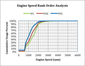
The 5th, 50th, and 95thpopulation percentiles were determined and plotted for each engine speed. For the 15 fleet vehicles, the results were plotted, figure 7.
Figure 7
In this case, the median rank plot, figure 7, is similar to the normal plot, figure 6. When the fleet size is large, computer software can quickly analyze the cumulative usage percentages at constant speed to determine the median rank population percentiles
Customer usage and development vehicle test can be compared with this method. If the patterns don’t match, then the development fleet tests may need to be modified to duplicate the customer usage.
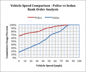
Another use is to compare unique customer types. For example, the median traces for police and retail sedans were compared, figure 8.
Figure 8
In figure 8, the idle time is the time operated at 0 mph. Police vehicles idle 66% of the time, while retail customer vehicles idle 16% of the time. Why? Police vehicles engines are running continuously during a shift, even while stopped, to keep their electronics operating. Meanwhile, retail vehicles are generally moving while their engines are operating. This analysis quantifies the difference.
A follow up analysis would analyze the distribution of engine idle times to determine the extreme idle times. The original telematics data was highly intermittent which prevented this analysis. This information would be valuable during vehicle design and development testing, but awaits future data.
Conclusions
When analyzing telematics continuous data for of a fleet of customer vehicles,
- Data was highly intermittent so statistical methods were required.
- Individual vehicle usage was not normally distributed.
- Individual vehicle usage needed to be standardized.
- The cumulative percentile histogram allowed comparison multiple vehicles.
- The variation between multiple vehicles could be analyzed statistically to characterize a typical (average or P50) usage and percentile extremes
Once the usage is quantified, engineering requirements and development tests are updated to assure the product survives customer extreme usage.
Note
If anybody wants to engage me on this or other topics, please contact me. I offer a free hour for the first contact to discuss your problem/concerns and to determine how I can help you.
I have worked in Quality, Reliability, Applied Statistics, and Data Analytics over 30 years in design engineering and manufacturing. In the university, I taught at the graduate level. I provide Minitab seminars to corporate clients, write articles, and have presented and written papers at SAE, ISSAT, and ASQ. I want to assist you.
Dennis Craggs, Consultant
810-964-1529
dlcraggs@me.com

 Ask a question or send along a comment.
Please login to view and use the contact form.
Thanks for your feedback. If there are points that you don’t agree with or there are alternative analysis approaches, please let me know. I will research them for potential changes in a future update to my article.