Let’s take a graphical view of reliability improvement that occurs during product development or improvement projects.
If we are making improvements the system reliability should increase. We can use the build, test, fix approach to measure improvements, find failures, design improvements, and repeat.
A Duane Plot is a graphical means to view the reliability growth and the rate of growth. Creating the plot is easy.
If the ith failure occurs at time ti, then plot ti divided by I versus the time ti. Note ti divided by t is an estimate of MTBF for the system, thus we are plotting the estimates of MTBF with each failure over time. Let’s try an example.
| Failure# | System Age at Failure | Cum MTBF |
|---|---|---|
| 1 | 33 | 33 |
| 2 | 76 | 38 |
| 3 | 145 | 48.3 |
| 4 | 347 | 86.8 |
| 5 | 555 | 111 |
| 6 | 811 | 135.2 |
| 7 | 1212 | 173.1 |
| 8 | 1499 | 187.3 |
Data from NIST Engineering Statistics Handbook, 8.1.9.2. Duane plots example 1, accessed Jan 11,th 2015. http://www.itl.nist.gov/div898/handbook/apr/section1/apr192.htm .
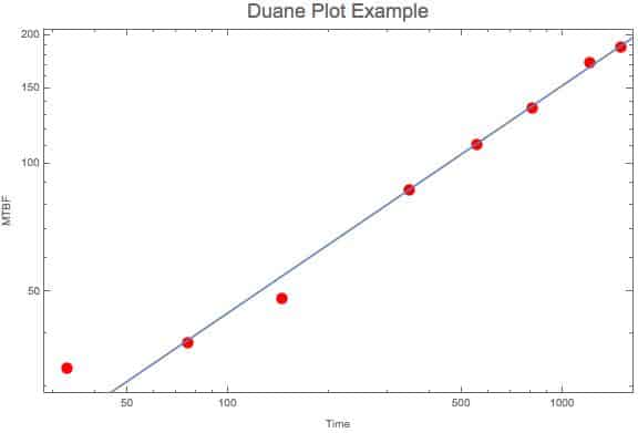
If we plot these results on a log log plot it should be a straight line, if it follows the NHPP Power Law reliability growth model. If there is some curvature, try fitting to the NHPP Exponential Law model. Here’s the log log plot.
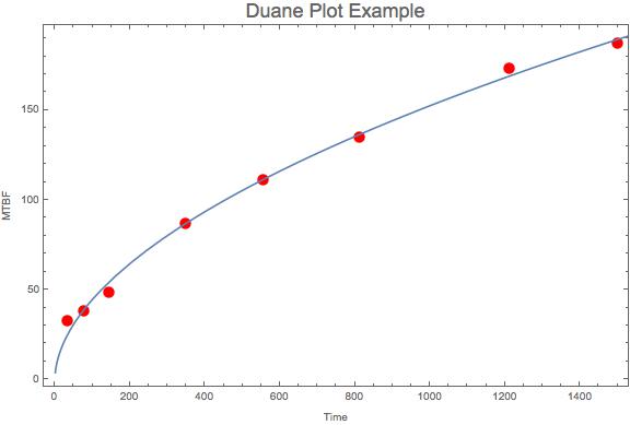
Other then the first point the fitted power low equation (line) fits the data reasonable well. And using normal axis the plot appears as
The concave bend or rolling over shows some indication that the system improvements are making the system more reliable. One way to interpret this plot is it shows improvement when it takes longer and longer between failures. A steep increasing line indicates plenty of room for improvement.
Related:
Reliability Growth Testing (article)
Censored Data and CDF Plotting Points (article)
Exponential Reliability (article)


 Ask a question or send along a comment.
Please login to view and use the contact form.
Leave a Reply