One of the first things taught in a data analysis class, or in first-grade math, is the plot. A graphical representation of the data. Bar charts, pie charts, histograms, box plots, and the x-y scatter plot. These and others simply help us to understand the nature of the data.
The ‘nature’? The data is only a record of an observation. Counts, colors, numbers, or something similar. The ‘nature’ is, to me, the behavior, maybe pattern, or story the data may reveal.
Back to the basics
We make measurements to learn something. We may want to know the strength of a plastic bracket and how it changes with time. We want to know the capacitance of a circuit and how it changes with temperature. We may want to know the rate of failures for a new product launch.
Let’s say we start working with a company making widgets. A few years ago they launched a product and the initial sale of 100,000 widgets have been tracked. They counted how many returns they received per month from that initial run of 100,00 over three years.
You are the new reliability guy and your boss sends you the ‘data’ and asks, “what does it mean?” Here’s the data:
699 913 1,957
743 935 2,091
773 967 2,225
796 1,013 2,358
814 1,070 2,492
830 1,140 2,628
845 1,223 2,766
859 1,320 2,907
871 1,430 3,050
881 1,553 3,198
890 1,686 3,349
900 1,821 3,507
Doesn’t mean much to me either. How is it organized, which number represents which month of returns, is the count cumulative or not? So, back to the source and ask a few questions. We learn that each column is a year, with months in order down the column. In the first month after shipping, 699 widgets came back, in the second month only 44 more units. The tally is cumulative. At the end of the first year, 900 unit out of the 100,000 shipped returned.
What is the story in the data?
Just a listing of numbers has the data and may reveal the information that is useful. For example, on quick inspection, it seems the first month had a large number of failures, and after that, the new failures seem to occur much less and maybe even going down. Hard to tell by just looking at the table of numbers. I find myself doing some simple calculations as I try to understand the story the data may contain.
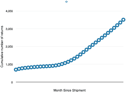
 Plotting the data by month reveals and jump at the start up to almost 700 returns, then a relatively flat section out to about 18 months, then a steady rise.
- Is something wearing out?
- Do the root causes for returns change before and after the inflection point?
- Will the next month’s return follow the pattern?
Another view may help
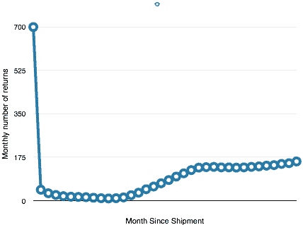
When I first looked at the number I started to look at differences. A plot of the number of returns by month may show how the rate of returns is changing, or if it is changing.
 This is interesting. There are the big first month returns, then a slow and steady decrease for about the first year. Then it increases steadily for about 9 months or so, then seems to level off. The story is getting more complex.
Next Steps
Just two plots and already we can see this is not a constant failure rate. That at different points in time, something changes. We don’t know what changes, yet we have clues including the number of failures and the timing. We can ask better questions.
Next, I would use the time to failure information and see what it looks like on a Weibull plot. Maybe try to track down more information on the failure causes and plot the data by cause over time. Maybe see how the Pareto of failures changes over time by plotting the number of types of failures by 3-month groups.
The table of numbers is just the data. It contains a story if we look. Plotting is a great first step, then we need to tease out the story.
- Why does the plot look the way it does?
- What causes the changes in slope?
Addition plots may help answer some of these questions and fill out the story. Often the initial look helps us to look for more information and flush out the story hidden in the data.
What’s your story? What are your favorite plots as you first look at reliability data?
 Ask a question or send along a comment.
Please login to view and use the contact form.
Leave a Reply