
In my prior article, “A Primer on Probability Distributions”, the usage of different types of histograms to display data was discussed. The histogram would acquire a bell shape if the data were normally distributed. The main limitation of the histogram approach is that the shape of the histogram can change radically with the selection of the bins used. Instead, a probability plot could be used.
This article discussed probability plots. They are extremely useful for the analysis of big and small data sets.
Median Ranks
Given a set of data, the first step should be to calculate the median rank. First, the data is sorted in ascending order. Then an order number, starting at 1 for the lowest, then 2 for the next lowest …ending at N for the largest, is assigned to each value. Rank Order statistics provides a means of determining a probability distribution for each value. Each probability distribution allows a median to be calculated. A reasonable approximation of the median is provided in formula 1.
$$ \frac{i-0.3}{N+0.4} $$ (1)
Here, the i-value is the order number and N-value is the sample size.
Uniformly Distributed Data
Let’s take a sample of 1000 values that are uniformly distributed, calculate the order number and median ranks. Then the median ranks and data are plotted figure 1.
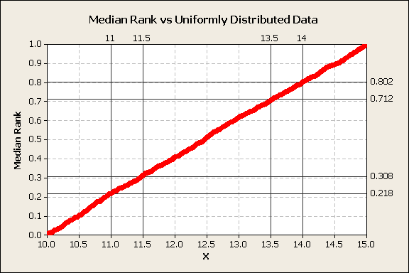
Figure 1
This chart shows that uniformly distributed random variables plot as a straight line when plotted against the median ranks. The fraction of data contained within each x interval is linearly dependent on the interval width. The percentile between 11-11.5 is the same as the percentile between 13.5-1, i.e., 9%.
The median ranks are the cumulative percentiles.
Normally Distributed Data
If 1000 points of normally distributed data are sorted, rank ordered, and median ranks calculated yields a different plot, figure 2.
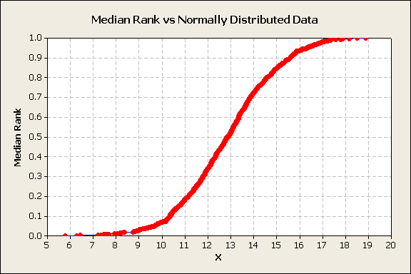
Figure 2
The plot of median rank vs. the x values is a cumulative distribution plot. It demonstrates an S shape curve. For purposes of making projections, it would be nice to determine a transformation that will linearize the plot. Fortunately, an inverse of the standard normal will accomplish this task. The y-axis is z-score, the number of standard deviations each x value is from the mean, figure 3.
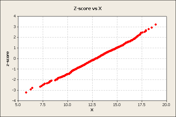
Figure 3
The inverse normal transforms the y-axis and linearizes plots of normally distributed data. However, to determine percentiles, it would be convenient to have a probability scale on the y-axis. This is accomplished by replacing the z-score values hand horizontal lines with ticks, labels, and horizontal lines that correspond to normal scale probabilities, perhaps 1%, 5%, 10%…90%, 95%, and 99%. This is called a normal probability plot, Figure 4.
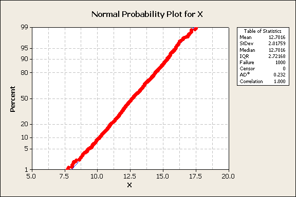
Figure 4
From the normal probability plot, it is easy to select the data values that correspond to different cumulative percentiles. Common percentiles of interest are 5%, 10%, 50%, 90%, and 95%. For example, in this data, the 95% data value is 16.02. A convention to indicate this is x0.95=16.02, shown in figure 5.
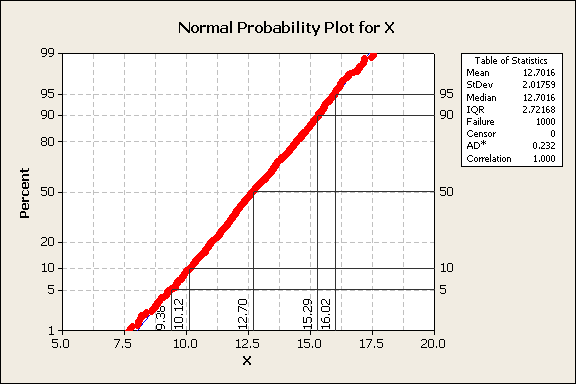
Figure 5
For reference, if x is normally distributed, then
$$f(x)=\frac{1}{\sigma\sqrt{2\pi}}e^{-(x-\mu)^2/2\sigma^2}$$ (2)
Here, f(x) is the probability density function of x.
Lognormally Distributed Data
A similar process occurs with lognormally distributed data. The data is sorted, ordered, median ranks are calculated, and plotted, figure 6.
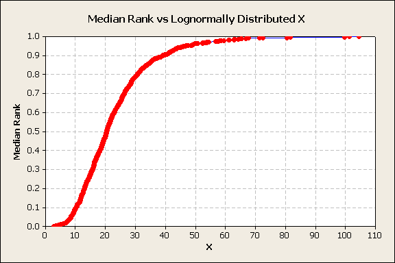
Figure 6
The data is obviously not linear when plotted against the median ranks. None of the data is below 0 and a few very large x values skew the distribution to the right. A log transformation is tried and produces a typical S-shape plot, figure 7.
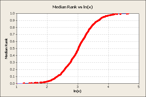
Figure 7
The S-shape suggests the inverse normal transformation of the y-axis, figure 8.
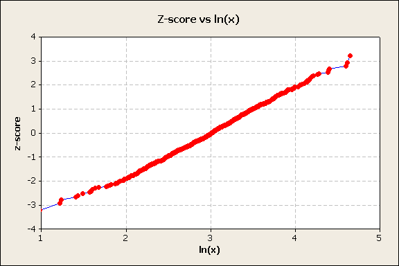
Figure 8
This indicates that if x is lognormally distributed, then ln(x) is normally distributed. Using Minitab’s plotting capability, the lognormal probability plot shown in figure 9.
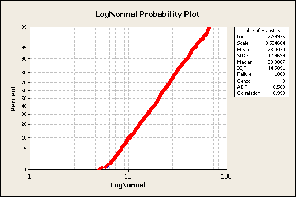
Figure 9
Minitab provides a table of statistics on probability plots. Note the data correlation to the best fit distribution is 99.8%. For reference, the lognormal probability density function is shown in equation 3.
$$ f(x)=\frac{1}{x\sigma\sqrt{2\pi}}e^{-(ln(x)-\mu)^2/2\sigma^2} $$ (3)
Here, f(x) is the lognormal probability density function of x.
The General Process
The common actions are
- Sort the data in ascending order.
- Assign order numbers starting with 1 for the lowest data value and ending at N for the largest data value.
- Calculate the median rank.
- Determine which distribution linearizes the data.
Alternatively, one can perform actions 1 to 4 using commercial software. I use Minitab software, which has a distribution ID plot that a plot using multiple distributions. An analysis is the lognormal data using the Minitab ID plot is, figure 10.
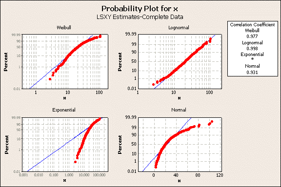
Figure 10
Visually, one can determine that the lognormal distribution indicated by the blue line provides the best fit to the data indicated by the red dots. The distribution ID plot includes a correlation box in the upper right. It shows the data has the highest correlation to the lognormal.
This discussion did not cover any confidence limits on the distribution. These confidence limits become important in the analysis of small datasets but are less significant with large datasets. This topic is reserved for a future article.
Conclusions
- Probability plots don’t have intervals defined as are used in histogram plots.
- Probability plots can be used to determine the best distribution to describe a set of data.
- Percentile values of the data can be determined, typically the 5th, 50th, and the 95th percentiles to estimate the distribution center and spread.
- Commercially available software can assist in creating probability plots.
- Minitab’s distribution ID plot allows the examination of multiple probability plots.
Dennis Craggs
Big Data, Quality, and Reliability Analytics
810-964-1529
 Ask a question or send along a comment.
Please login to view and use the contact form.
Leave a Reply