
In my prior article, an overview of vehicle telematics was provided. Telematics data includes time stamped records and fields containing count or parametric data recorded from the vehicle CAN bus. The count data is always a non-negative integer and the parametric data is stored as real numbers, generally in scientific format. This article focuses on the analysis of counting data.
Count data is used to monitor events, i.e., the number of trips, the days of operation, the calendar date, door open/close cycles, the number of engine starts/stops, or other variables. So, if a variable is selected for analysis, how can it be analyzed and a vehicle be characterized? How can fleets be analyzed? Can vehicle usage percentiles be determined?
Trip Count Analysis
For this article, lets consider the analysis of trip count data. The data was scaled from actual telematics data to avoid revealing proprietary information. Graphics allows an analyst to visualize the data and to detect abnormal usage patterns.
In the vehicle architecture, there is a trip counter, maintained in electronic memory that is incremented by one count for each trip. The trip count is included in each record as a field value. However, the trip count value is invariant for every record of the same trip. This method of recording the data is not efficient, but it is very robust as it is unlikely that any data intermittencies will erase the trip records.
The analysis must consider possible sources of bias. For example, when a telematics module is installed, it starts collecting data for the short trips in the garage and parking lot. The trip counter values will be different than normal for the vehicle. Another example of bias is that new vehicle will be used more frequently than an older vehicle. The proud owner shows his friends and neighbors his new vehicle. Vehicle owners will preferentially use a new vehicle vs. an older vehicle. To minimize the bias, I required a minimum of 30 days usage for the data to be included in the analysis. One should consider appropriate ways to filter your data.
Scatter Plot
The analysis starts by determining the number of trips and days for each vehicle, equations 1 and 2.
$$trips=MAX(TripCount)-MIN(TripCount)+1$$
(1)
$$days=MAX(Time)-MIN(Time)+1$$
(2)
Note, the plus 1 was required to properly count trips events and days.
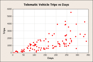
The raw trips and days for each vehicle are displayed graphically to determine if any unusual patterns are displayed, figure 1.
Figure 1
This graphic shows the general pattern of increasing trip counts with days, and a lot of scatter about a linear trend line. This trend suggests calculating the trips/day for each vehicle would be a way to standardize the analysis.
Median Rank Analysis
The general linear trend of trips vs. days suggests calculating the trips/day for each vehicle would be a way to standardize the analysis. The trips/day then could be display in a median rank chart following the procedure:
- For each vehicle, calculate the trips/day.
- Sort the trips/day from lowest to highest.
- Assign a rank order number, i, to each value, with the lowest rank being 1 and the highest rank being N, the number of vehicles.
- Calculate a median rank percentile for each vehicle using equation 3,
$$P{(i)}=\frac{i-0.3}{N+0.4}$$
(3)
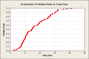
- Plot the trips/day vs. the median rank percentiles, figure 2,
Figure 2
The data contained a wide mixture of vehicle and customer types. The chart shows a pattern shifts at 4 trips/day and another shift at 16 trips/day. These would be investigated to identify the cause of the shifts.
In this data set, commercial vehicles were included. Some commercial vehicles had many short trips every day and produced the upper tail of the curve. Police vehicles, which are run continuously during a shift, were included and had only a few trips/day. They were responsible for the lower tail of the distribution. Other vehicle types included cars, minivans, trucks, and SUVs. A better analysis would select a vehicle and/or customer type at the beginning of the analysis.
The trips/day median rank plot allows the analyst to determine various usage percentiles directly from the chart, when there is a lot of data.
Distribution Analysis
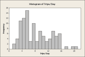
When the data is plentiful, one may conduct a statistical analysis to determine the distribution that best describes the data. When there is very little data, that distribution is applied to estimate trips/day percentiles. The analysis of the distribution of trips/day starts with a histogram of the raw data, figure 3.
Figure 3
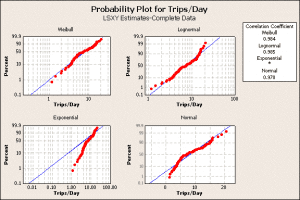
The histogram provides convincing evidence that the data is not normally distributed for two reasons. First, it is skewed to the right while a normal distribution is symmetric about the center. Second, the trips/day statistics must be 0 or greater and a normal distribution would predict negative trip/day values, which is not physically possible. One may want to consider a lognormal or Weibull distribution in the analysis. Minitab software has a distribution ID tool that creates a graphic that compares different distributions, figure 4.
Figure 4
The normal, exponential, Weibull, and lognormal were selected for the distribution ID plot. The best probability distribution to describes the data will show a pattern where most the red dots (the data) approximately follow the blue line. The blue line, in each plot, represent the distribution calculated from the data. Also, this distribution will have a very high correlation coefficient, displayed in the upper right table. In this data set, the Weibull distribution is the best model to use for trips/day statistics. The next step is to create a more detailed Weibull plot with percentile values, figure 5.
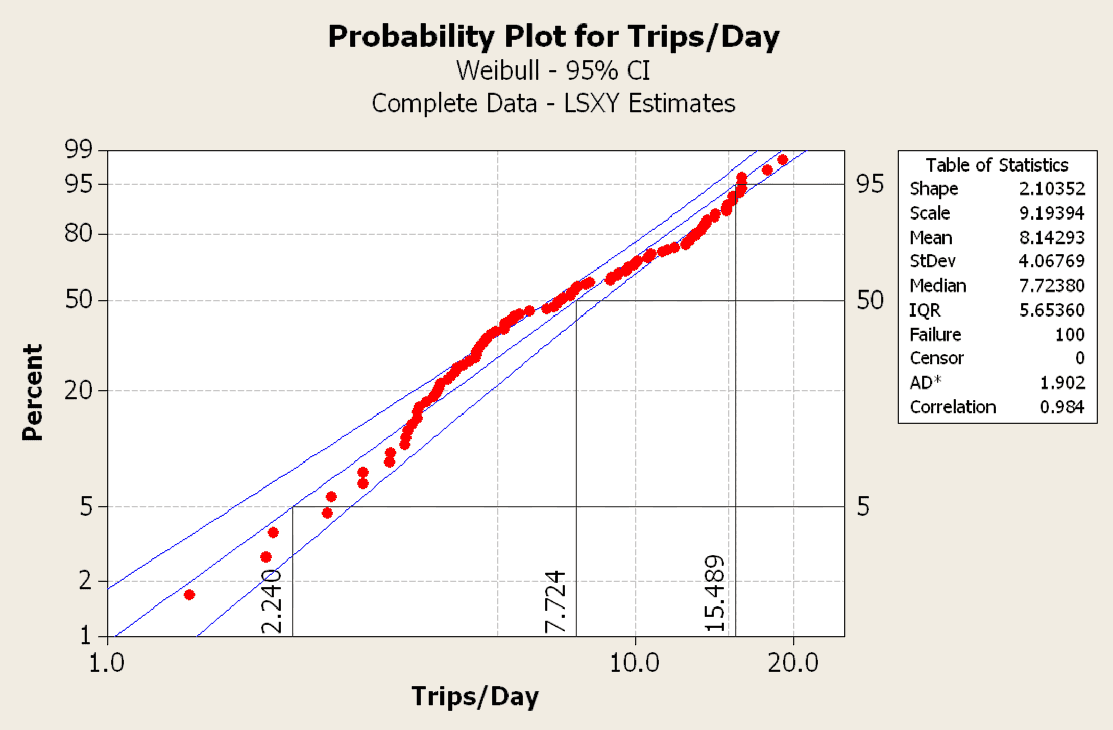
Figure 5
In this graphic, lines were added manually to define the 5th, 50th, and 95th percentiles showing the 2.24, 7.72, 15.49 trips/day, respectively. To create any other percentile, select the desired percentile from the y-axis, move horizontally to the data or best-fit line, and then drop to the x-axis to read the trips/day.
Since the original data set included a mix of vehicle, including commercial, the analysis was repeated for different vehicle segments. Commercial and fleet vehicles are not used like retail sales vehicles. In this case, analyzing only retail vehicle usage yielded about 10 trips/day for a 95th percentile customer. For a 10-year life target, the requirement would be 36,500 trips.
Conclusions
If the 36,500 trips in 10 years validated current specifications, then no change is required. If the results were significantly different, then the component specifications and verification tests would need to be updated.
This type of analysis can be repeated for any type of counting data and will result in better product validation.
Note
If anybody wants to engage me on this or other topics, please contact me. I offer a free hour for the first contact to discuss to determine how I can help you. This may involve test planning, analytics, or teaching/training.
I have worked in Quality, Reliability, Applied Statistics, and Data Analytics over 30 years in design engineering and manufacturing. In the university, I taught at the graduate level. I provide Minitab seminars to corporate clients, write articles, and have presented and written papers at SAE, ISSAT, and ASQ. I want to assist you.
Dennis Craggs, Consultant
810-964-1529
dlcraggs@me.com
 Ask a question or send along a comment.
Please login to view and use the contact form.
As more and more companies start adopting big data as an integral part of their decision making process, the ones that don’t go data-backed will have a serious disadvantage. It won’t be long before all businesses start harvesting, analyzing and turning data into actions. I completely agree with the points you’ve made here.
The biggest gaps are in the new types of data, such as telematics and the internet. Older data types, i.e., warranty and customer surveys, are being analyzed. Some of the data mining methods should be applicable to warranty.
It is a relatively new field to explore for many industries and these type of project are really helpful in creating a better roadmap for them. More people should involve in data collection and processing which in turn will help telematics to grow faster. By the way nice data analysis. Kudos!
Thanks for your comments. Using this data to validate design requirements should improve quality and reliability over the product life.
SO insightfull and detailed analysis on telematics and big data loved it
I’m glad that you liked the article. I wrote a series of articles to introduce the concept of distribution analysis of vehicle telematics data. The basic goal is to characterize low, typical, and high vehicle usage. In automotive, this is typically a 5th, 50th, and 95% percentile user. Then the design and development engineers have some design targets. Counting data is the simplest, parametric data is amenable to analysis. Uni-variate variable data distributions (vehicle speed, engine speed, torque…) are easily developed. Bivariate data (engine torque vs. speed) are can be analyzed. I wanted to develop a 5th and 95th percentile analysis, but it was on the back burner when I retired from FCA. It is possible to consider other factors, like the transmission gear being used, to develop the torque x speed for components in the drive line. This helps the engineer performing fatigue analysis. Lots of potential for developing better design data for engineers.
The main limitations to the methods are data collection, storage, and processing. With connected vehicles, the data collection issues should be solved. Cloud storage would help store the massive amounts of potential data. Parallel processing (perhaps on the cloud) would assist data analysis. All of this would require programming so development is required to accomplish these tasks.