Accendo Reliability

Your Reliability Engineering Professional Development Site

  • Home
  • About
    • Contributors
  • Reliability.fm
    • Speaking Of Reliability
    • Rooted in Reliability: The Plant Performance Podcast
    • Quality during Design
    • Critical Talks
    • Dare to Know
    • Maintenance Disrupted
    • Metal Conversations
    • The Leadership Connection
    • Practical Reliability Podcast
    • Reliability Matters
    • Reliability it Matters
    • Maintenance Mavericks Podcast
    • Women in Maintenance
    • Accendo Reliability Webinar Series
    • Asset Reliability @ Work
  • Articles
    • CRE Preparation Notes
    • on Leadership & Career
      • Advanced Engineering Culture
      • Engineering Leadership
      • Managing in the 2000s
      • Product Development and Process Improvement
    • on Maintenance Reliability
      • Aasan Asset Management
      • CMMS and Reliability
      • Conscious Asset
      • EAM & CMMS
      • Everyday RCM
      • History of Maintenance Management
      • Life Cycle Asset Management
      • Maintenance and Reliability
      • Maintenance Management
      • Plant Maintenance
      • Process Plant Reliability Engineering
      • ReliabilityXperience
      • RCM Blitz®
      • Rob’s Reliability Project
      • The Intelligent Transformer Blog
    • on Product Reliability
      • Accelerated Reliability
      • Achieving the Benefits of Reliability
      • Apex Ridge
      • Metals Engineering and Product Reliability
      • Musings on Reliability and Maintenance Topics
      • Product Validation
      • Reliability Engineering Insights
      • Reliability in Emerging Technology
    • on Risk & Safety
      • CERM® Risk Insights
      • Equipment Risk and Reliability in Downhole Applications
      • Operational Risk Process Safety
    • on Systems Thinking
      • Communicating with FINESSE
      • The RCA
    • on Tools & Techniques
      • Big Data & Analytics
      • Experimental Design for NPD
      • Innovative Thinking in Reliability and Durability
      • Inside and Beyond HALT
      • Inside FMEA
      • Integral Concepts
      • Learning from Failures
      • Progress in Field Reliability?
      • Reliability Engineering Using Python
      • Reliability Reflections
      • Testing 1 2 3
      • The Manufacturing Academy
  • eBooks
  • Resources
    • Accendo Authors
    • FMEA Resources
    • Feed Forward Publications
    • Openings
    • Books
    • Webinars
    • Journals
    • Higher Education
    • Podcasts
  • Courses
    • 14 Ways to Acquire Reliability Engineering Knowledge
    • Reliability Analysis Methods online course
    • Measurement System Assessment
    • SPC-Process Capability Course
    • Design of Experiments
    • Foundations of RCM online course
    • Quality during Design Journey
    • Reliability Engineering Statistics
    • Quality Engineering Statistics
    • An Introduction to Reliability Engineering
    • An Introduction to Quality Engineering
    • Process Capability Analysis course
    • Root Cause Analysis and the 8D Corrective Action Process course
    • Return on Investment online course
    • CRE Preparation Online Course
    • Quondam Courses
  • Webinars
    • Upcoming Live Events
  • Calendar
    • Call for Papers Listing
    • Upcoming Webinars
    • Webinar Calendar
  • Login
    • Member Home

by Fred Schenkelberg Leave a Comment

Using a Strip Chart

Using a Strip Chart

Sometimes we just need a simple plot of a few data points. When there is scant data a histogram or box plot just is not informative. This is a great use for a one dimensional scatter plot, dot plot, or a what is called a strip chart in R.

The basic idea is to see where the data lines along a line. For example, let say we have 20 times to first failure. A table of numbers is not all that helpful. We could explore using a cumulative distribution plot (Weibull analysis), yet it would be difficult to fit a distribution with so little data.

Let’s turn to a strip chart to get a look at the data.

The Data

We’ve just launched a product and now have reports of the first 20 field failures. Here’s the data in days.

8 56 3 15 60 4 13 10 1 5 11 1 1 19 1 6 12 12 6 9

A summary of the data provides:

Min. 1st Qu. Median Mean 3rd Qu. Max.

1.00 3.75 8.50 12.65 12.25 60.00

We enjoyed at least one failure the first day and one system survived 60 days. Yet there is more to learn here. A scan through the data shows 3 failures occurred on day 1.

Plotting the Data

To create a strip chart is rather straight forward. Just draw a line for the x-axis and mark off tick marks that cover the range of the data. For the sample data above, a line that spans from 0 to 60 is fine.

Then mark (I’m using R and the marks for each data point is a small square) the location of each data point along the line.

In R I loaded the data into a vector named x and ran the command stripchart(x) to create this plot.

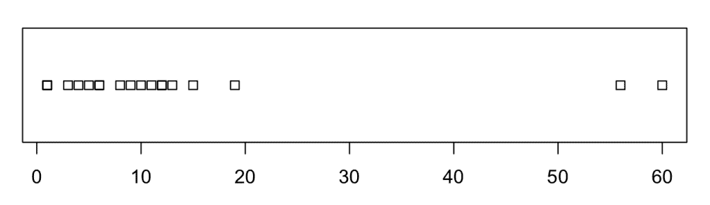
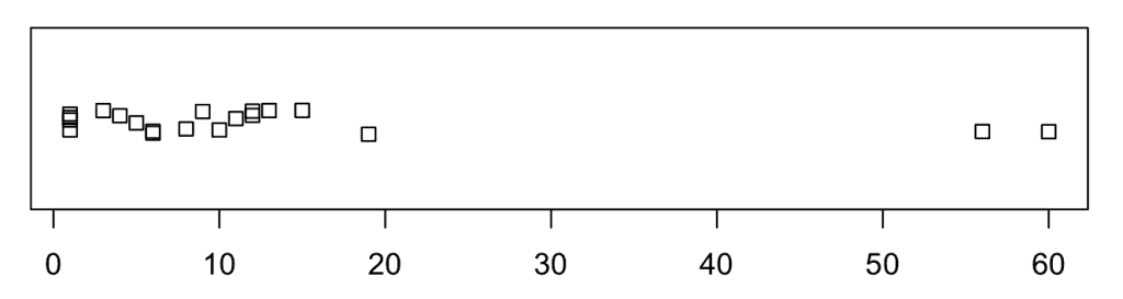
Now, we do know by inspection of the dataset, there are 3 points at day one, so this plot using default settings is hiding some of the data. Let’s try a plot that jitters the marks when they overlap.

stripchart(x,method=”jitter”,jitter=0.1) produces the following plot.

Another method is to stack the data points that repeat. This makes it clear how many failures occur if more than one occurs the same day.

stripchart(x,method=”stack”,offset=0.5) produces the following plot.

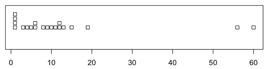
Hum, there seem to be four failures on day one, which I missed scanning the dataset.

All of these plots do show more failures earlier and just a few occurring later. This may indicate a declining hazard rate over time.

Compare to Histogram or Box Plot

For most any dataset I would have first attempted a histogram, so let’s see what a basic histogram would reveal. Here I’m using the command hist(x) in R.

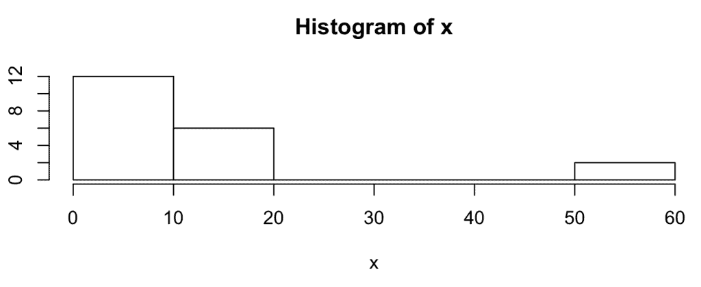
We could draw the declining hazard rate conclusion, yet the plot doesn’t have as much information as in the strip charts above.

How about a box plot, what would it reveal? Still in R and using boxplot(x) creates the following plot.

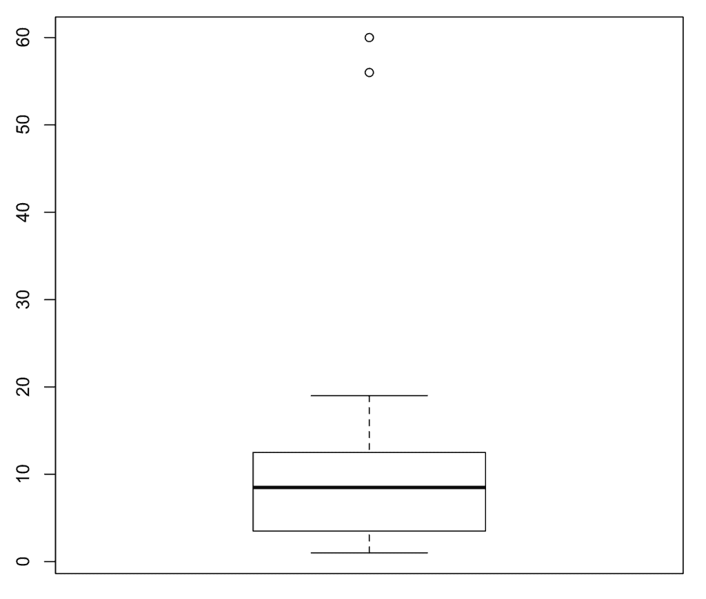
Here we do see most occur early, yet we again lose some of the information provided in the strip chart.

Summary

A strip chart is handy when taking a look at a small set of one-dimensional data. It shows all the data, and since there aren’t too many points cluttering the plot, it is informative.

Histograms and box plots are not quite as useful in a small dataset situation. So, my recommendation is to turn to a strip chart when first plotting a small data set.

Filed Under: Articles, CRE Preparation Notes, Probability and Statistics for Reliability

« Calibrations
Demystifying Business Requirements »

Leave a Reply Cancel reply

Your email address will not be published. Required fields are marked *

CRE Preparation Notes

Article by Fred Schenkelberg

Join Accendo

Join our members-only community for full access to exclusive eBooks, webinars, training, and more.

It’s free and only takes a minute.

Get Full Site Access

Not ready to join?
Stay current on new articles, podcasts, webinars, courses and more added to the Accendo Reliability website each week.
No membership required to subscribe.

  • CRE Preparation Notes
  • CRE Prep
  • Reliability Management
  • Probability and Statistics for Reliability
  • Reliability in Design and Development
  • Reliability Modeling and Predictions
  • Reliability Testing
  • Maintainability and Availability
  • Data Collection and Use

© 2023 FMS Reliability · Privacy Policy · Terms of Service · Cookies Policy

This site uses cookies to give you a better experience, analyze site traffic, and gain insight to products or offers that may interest you. By continuing, you consent to the use of cookies. Learn how we use cookies, how they work, and how to set your browser preferences by reading our Cookies Policy.