The basic idea of reliability growth is the information learned during testing allows the team to make improvements.
The improvements then reveal themselves in the next round of testing. There are improvements during each test phase as the immediate fixes occur.
Plus some improvements may have longer lead times and be implemented in time for the next round of testing.
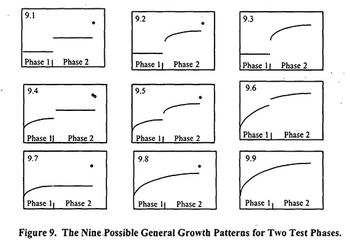
In general, there are nine common patterns to reliability growth tracking. The following graphs show time (x-axis) vs reliability (y-axis). The phases represent different stages of the product development life cycle.
From the AMSAA, Technical report No.TR-652, AMSAA Reliability Growth Guide, September 2000. (Download TR-652 here)
Figure 9.1 shows all fixes in each phase delayed to the end of the testing, thus flat line and step improvement.
Figure 9.2 – 9.8 show a mix of fixes occurring during and after testing phases. A flat line or jump in reliability indicate delayed fixes. A curved line indicates improvements to reliability during the testing phase.
Figure 9.9 shows continuous fixes during the program.
None of the curves are better or worse and may reflect the technical and logistic difficulty of implementing fixes.
Related:
Duane Plot of Cumulative Failures Over Time (article)
Reliability Growth Testing (article)
Sources of Reliability Data (article)

 Ask a question or send along a comment.
Please login to view and use the contact form.
Leave a Reply