Using the right plot enables your team to know what is working or need improvement.
Part 4 of 7
Your facility has data and maybe too much data. Using simple plotting may be the key to unlocking how well your maintenance program is performing.
Building on the concept of reliability growth modeling James Kovacevic described a convenient way to quickly visualize your repairable system failure data is with a mean cumulative function (MCF) plot.
The unacceptable and common approach
When confronted with a table of numbers our natural inclination is to find the average. It the average time to failure is a large number that is better than a smaller value. Yet what does that really tells us about or maintenance program?
Not much.
We obscure any patterns or trends within the data by calculating the average. Given a single value, say 34,000 hours MTBF, does not reveal if the equipment is being effectively maintained or not.
Plotting weekly, or even by shift, MTBF values may reveal meaningful changes, yet given the smoothing nature of averages, a trend has to be major before it becomes apparent using this method.
A data example
Let’s work an example and see how even simple plots can help us find the story the data wants to tell.
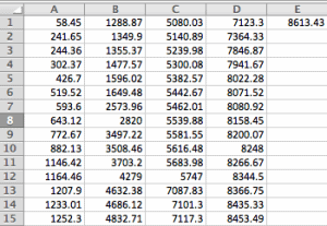
Here’s some data from a piece of equipment. When it fails a technician responds and repairs the equipment. The data is the time of the failure report in hours from the start of the year. Thus, 58.45 hours is a little over two days since the start of the year.
Here’s a screen shot of the data in a spreadsheet. All data is in hours.
Even studying the table of numbers doesn’t help reveal the story within the 61 pieces of data. We do know that there are about 2 failures per month on average.
There seem to be groups of failures and a few stretches without failures.
First plot of the data
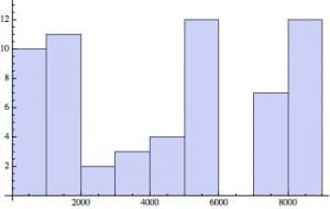
A good first plot for any dataset is a Histogram. It may reveal a pattern or part of the story.
Since the data was collected over a year, I created the first plot with 12 bins which will roughly break down the failure data into month-long buckets.
No obvious pattern.
We might need more data going back a few years, or possibly plotting time between failures would be more revealing. It’s easy to experiment and quickly detect if any explainable pattern exists.
A mean cumulative function plot
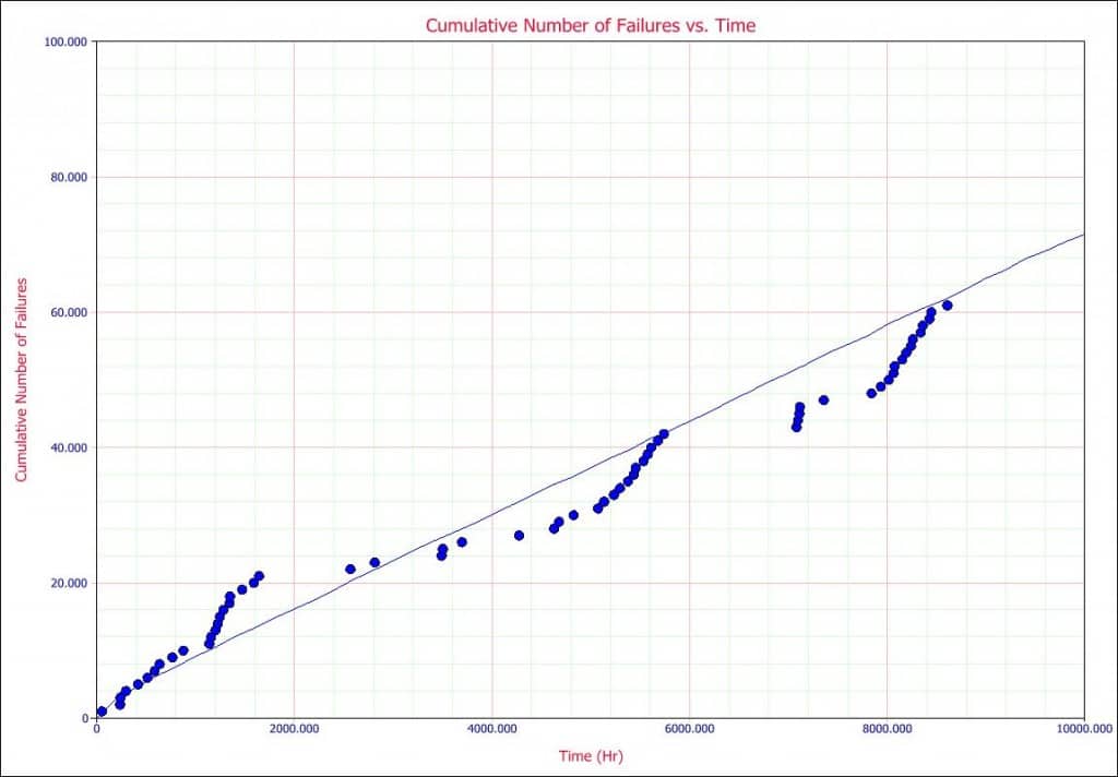
Since the data is from a single repairable unit, I’ll try a mean cumulative function plot.
It is a plot of time in hours versus the count of failures to date. With each failure, the vertical position of the plotted point is incremented up by one.
You can learn more about the approach and advanced ways to evaluate the data within Wayne Nelson’s paper Graphical Analysis of Repair Data.
Now, this is interesting. What are those groups of failures and what happened to cause a long period without failures? Are the repairs helping or hurting the reliability of the system?
These questions come from the plot of the data.
This is the start of the story.
With a few queries, we learned that the clusters of failures are commonly a string of no trouble found. The technician did a quick visual inspected, started the equipment and moved on to the next project. After a string of maybe 10, no trouble founds, a relatively major repair would take place. In two of the instances, the equipment was down for a couple of weeks (hence no failures showing over an extended period.)
Summary
Tracking a grand average of downtime or number of failures per month did not reveal much information. The mean cumulative function plot caused us to ask a few questions, to look at specific repair logs, and to explore why the pattern we see happens.
Looking at a table of numbers or a log sheet of repair notes is a very difficult way to determine what is happening. A simple plot is often all that is needed to hear what the data has to say.
Plot the data a few different ways. Learn to hear what the data has to say.
Find the questions that may lead you to make reliability improvements.
Fred Schenkelberg is an experienced reliability engineering and management consultant with his firm FMS Reliability. His passion is working with teams to create cost-effective reliability programs that solve problems, create durable and reliable products, increase customer satisfaction, and reduce warranty costs. If you enjoyed this article, consider subscribing to the ongoing series at Accendo Reliability.

All seven articles in this series in one short ebook, interested?
Please login with your site registration to download this ebook which includes all seven articles in this series.
Login
If you haven’t registered, it’s free and takes only a moment.
The other articles in the series include:
Post 1 – Using the Maintenance Data You Already Have
Post 2 – The What & More Importantly, The Why of the Weibull Analysis
Post 3 – Quantify the Improvements (or Gaps) In Your Reliability
Post 4 – First Step in Analyzing Repairable Systems Data
Post 5 – The Next Step in Your Failure Data
Post 6 – The Next Step in Your Data Analysis
Post 7 – Data Q&A with Fred & James
References:
Fred Schenkelberg- accendoreliability.com/about/fred-schenkelberg/
FMS Reliability www.fmsreliability.com
Accendo Reliability accendoreliability.com/musings/
Wayne Nelson’s paper Graphical Analysis of Repair Data.


 Ask a question or send along a comment.
Please login to view and use the contact form.
Leave a Reply