
The most common types of engineering data are measurements. There can be a few, thousands, or millions of data points to analyze. Without analytic tools, one can get lost in the data.
This article presents
- Dotplots
- Data if frequently clustered about a central value and displays variation.
- Frequency histograms
- Distribution characteristics
- Normal Distributions
Dotplot
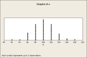
A common way to display data is plot the counts in intervals. Here is a plot of 150 measurements where each measurement was rounded to the closest even integer value. Here each interval is a bin centered at an even integer with a width of two units. Each dot represents a measurement so the stack height represents the count. This produced a dotplot, figure 1.
Figure 1
The plot shows where the data is centered and how the data is distributed. The center is about 100 and the data range from 92 to 108. Note that the data has an approximate bell shape, a typical bell curve described by the normal distribution.
If one relied on numerical indices calculated from the raw data, then the average is 100.08 and the standard deviation is 2.75, which is consistent with the graphical results.
Histograms
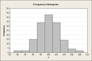
A frequency histogram can be constructed to be similar to the dot plot. In this example, bars are used for the counts, figure 2.
Figure 2
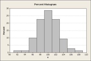
With more data, the height of the bars will trend higher. To compensate for this change, use a percent scale on the y-axis to create a percentile histogram, figure 3.
Figure 3
The percent histogram is useful when comparing different size datasets. From this histogram, one could project that 16% of the future data may fall in the 100±0.5 interval. Alternatively, 96% of the data is between 95 and 107.
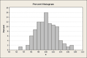
It needs to be stated that the histogram shape and the bar heights are affected by bin sizes. For example, Figure 3 used a bin width of 2 centered at each even integer. If the bin width is decreased, the counts in each bin generally decrease. The histogram in figure 4 uses the same data as the histogram in figure 3.
Figure 4
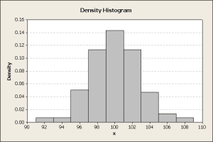
These percentages are dependent on the interval width. Wider intervals will probably contain more of the data and therefore a larger percentage of the data. To standardize for this effect create a density plot by dividing the percentile by the interval width. Now the y-axis the density units are probability/width-units. The concept is similar to describing the loading on a beam in lb/ft, i.e., a density function. In this case, the histogram height scale changes, figure 5.
Figure 5
If a lot more data is available, as in big data analytics, a finer resolution of the shape of the density curve is achieved by increasing the number of intervals while simultaneously decreasing their width. This leads to the creation of a smooth curve that can follow a mathematical function, known as a probability distribution.
Probability Distributions
If a function f(x) can be found to describe the smoothed density plot, then f(x) is the probability density function, which is sometimes abbreviated pdf. It describes the probability density. Probability P is the area under the function f(x) over an interval bounded by x1 and x2. Equation 1 describes the relationship,
$$ F(x_1,x_2)=\int_{x_1 }^{x_2}f(\phi )d\phi $$
(1)
Distributions have some important characteristics:
- The probability density f(x) is defined for all values of x.
$$ f(x) \geq 0 $$
(2)
- The cumulative probability F always increases, i.e., is a monotonically increasing function. So for x2>x1,
$$ F(x_2) \geq F(x_1) $$
(3)
- The sum of all probabilities equals 1 is equivalent to stating the area under the distribution curve equals 1,
$$ \int ^\infty_{-\infty} f(\phi)d\phi = 1 $$
(4)
From these relationships, limits that contain a fraction, P, of the population can be calculated as in equation 1. If the data is normally distributed, equation 6,
$$ f(x)={\frac{1}{{\sqrt{2\pi}}\sigma}}e^{-(x-\mu)^2/2\sigma^2}$$
(5)
The probabilities can be calculated as the area under the curve, but this is difficult. Instead a standard normal is used, equation 6,
$$ f(z)={\frac{1}{\sqrt{2\pi}}}e^{-z^2/2} $$
(6)
The integration limits in the original data are mapped to the standard normal integration limits, equations 7 and 8,
$$ z_1={\frac{(x_1-\mu)}{\sigma}} $$
(7)
and
$$ z_1={\frac{(x_2-\mu)}{\sigma}} $$
(8)
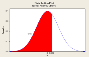
Here the z-value is the number of population standard deviation from the population average. Tables of z-values for the cumulative of the standard normal, equation 5, are readily available in most statistical references, however, there are several common variants. One variant provides the lower tail or cumulative probability for different z-values. Another type provides the upper tail probability. These can be seen graphically in figure 6.
Figure 6
The lower tail probability is the area under the distribution curve highlighted in red. The upper tail probability is the remaining area in white. One has to understand how to use any statistical table of normal probabilities.
For the above plot, a z-value (x shown in the plot) of 0.385 corresponds lower tail probability of 0.65 or 65%. Similarly, the upper tail probability is 0.35 or 35%.
Usage
So how can these tables and plots be used?
A common problem is to define limits that contain some percentage, say 99%, of the population. First, one has to calculate the sample average and standard deviation. An approximation of these limits can be calculated by assuming the sample average equals the population average and the sample standard deviation equals the population standard deviation. Because the distribution is symmetrical about the average, we want 1% of the population to be apportioned equally to the upper and lower tails of the distribution. Therefore, we want to calculate 0.5% and 99.5% population limits. The equations 7 and 8 may be inverted for the calculation yielding equations 9 and 10.
$$ x_1=\mu+z_1\sigma $$
(9)
and
$$ x_2=\mu+z_2\sigma $$
(10)
From a table of the lower tail standard normal, z1=-2.575 and z2=+2.575. With the average = 100.08 and the standard deviation = 2.75, the 99% population limits are calculated as 93.64 and 106.52.
In future articles, I will expand on this topic to introduce other probability distributions, probability plots, hypothesis tests, and other topics. These methods may be applied to both large and small datasets.
Conclusions
- Dotplots are a simple and easy way to view data.
- Graphics help to determine if the data is normally distributed.
- Frequency, percentage, and density histograms lead to probability distributions.
- The normal plot and probability tables may be used to determine limits that contain desired percentiles of the data.
- Both numerical and graphical methods are used for analysis.
Dennis Craggs
Big Data, Quality, and Reliability Consultant
810-964-1529
 Ask a question or send along a comment.
Please login to view and use the contact form.
Leave a Reply