Introduction
In my prior article, the assumptions behind SPC were discussed in detail except for the analysis. There are two types data that may be analyzed, Counts and Measurement variables. This article focuses on normally distributed measurement variables, and the construction and usage of $-\bar{X}-$ and R charts.
Measurement Variables
Measurement data are recorded as real numbers that can have virtually infinite number of values over a reasonable range. Sometimes, the physics restricts the range of the data to any non-negative real value. Such is the case when measuring a physical dimension or a value like electrical resistance. Another restriction is the practical dimensional range of values. For example, a hole in a part can’t exceed the size of the part. Frequently, tooling dimensions will limit the maximum and minimum possible dimension that can be created by a manufacturing process. These restrictions are independent on the part tolerances. which are set to achieve product features like form, fit, function, and reliability.
Normal Distribution
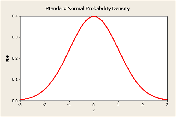
My article, Process Capability Analysis II, included a section on calculating probabilities using a normal distribution, figure 1.

Figure 1
These probability calculations will be used to develop some of the statistics found in this article, but to save space, are not included in this article.
Constructing Control Charts
Control charts are constructed using data collected from a process that is stable and subject to only common causes of variation. In an initial study, there is a subjective assessment that special causes are absent If special causes are identified, the control charts can be redesigned based on the updated information.
The process is sampled to obtain groups of data for analysis. A sample group could be a production shift, day of production, or some other rational grouping. To simplify the analysis, sample groups should have similar sample sizes. The average and range of each group are calculated.
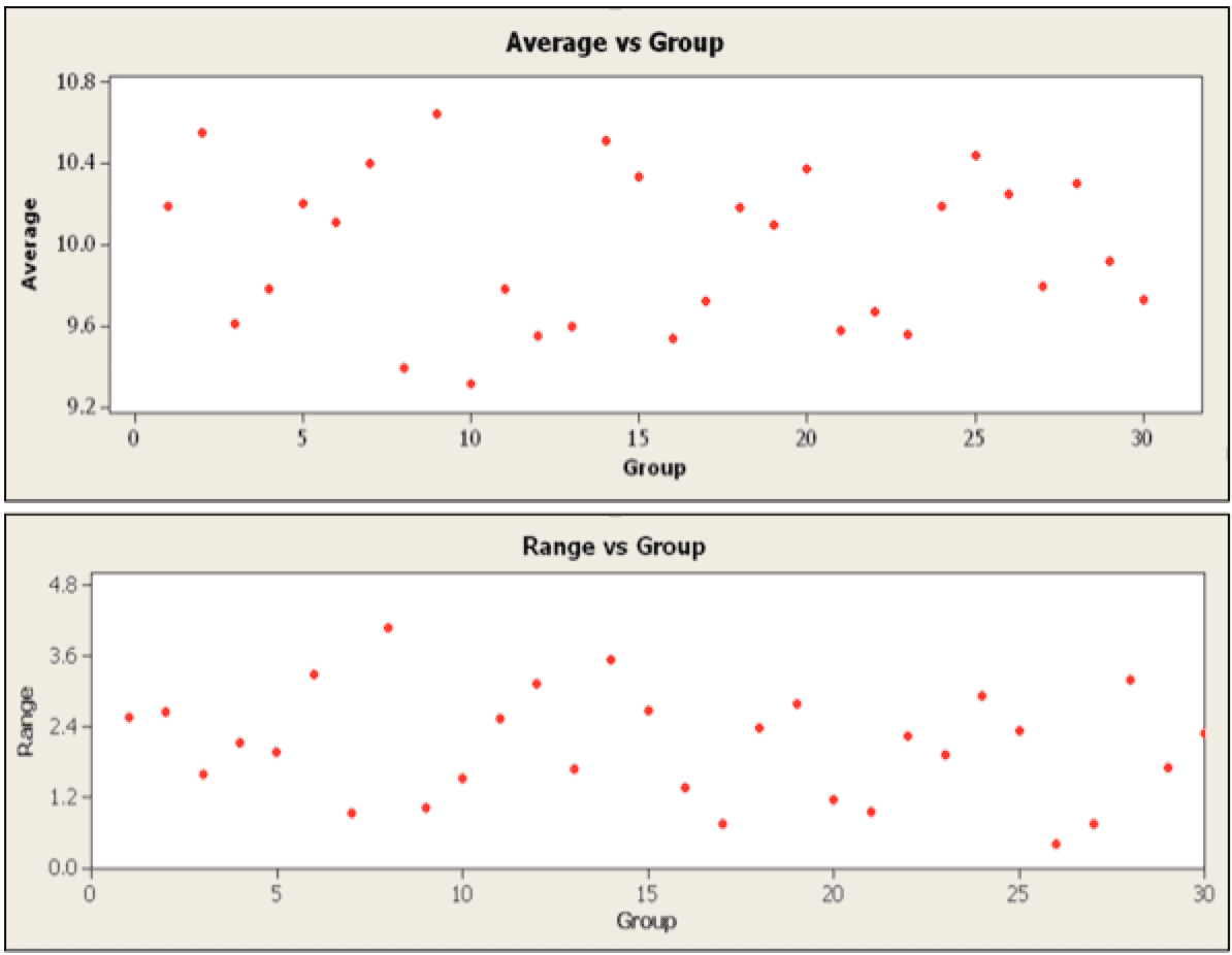
Scatter plots can be used to display each group average ($-\bar{X}-$) and each group range. Generally, the average and range are plotted on the y-axis. The x-axis is a timeline or observation group number. For convenience, the x-axis scales used for the two charts are identical and aligned so the user can compare the average and range data together. The results for 30 subgroups of size 10 from a normally distributed population with a mean of 10 and standard deviation of 1 are plotted in figure 2.

Figure 2
The data shows a lot of scatter in both plots. For the average plot, the scatter appears to be consistent and indicates the presence of common causes of random variation. The range plot shows similar scatter, but there are two high points. Are these special? To answer this question, each plot it enhanced with the average and control limits to form control charts.
$-\bar{X}-$ Chart
To construct the $-\bar{X}-$ chart from the average plot, add the grand average ($-\bar{\bar{X}}-$) of each group, the Upper Control Limit (UCL), and the Lower Control Limit (LCL). The UCL and LCL are based on the normal distribution. These limits are calculated as
$$UCL_\bar{X}=\bar{X}+\frac{3\sigma}{\sqrt{n}}$$
(1)
$$LCL_\bar{X}=\bar{X}-\frac{3\sigma}{\sqrt{n}}$$
(2)
Since we are using range instead of $-\sigma-$, an alternate equation is needed,
$$UCL_\bar{X}=\bar{X}+A_2\bar{R}$$
(3)
$$LCL_\bar{X}=\bar{X}-A_2\bar{R}$$
(4)
The %-\sigma-% is estimated from %-\bar{R}-% using a d2 factor
$$\sigma=\frac{\bar{R}}{d_2}$$
(5)
Then we calculate the A2 factor as
$$A_2=\frac{3}{d_2\sqrt{n}}$$
(6)
Factors A2 and d2 have been published for different subgroup sizes.
The Central Limit Theorem provides the justification to analyze the averages with a normal distribution.
In probability theory, the central limit theorem (CLT) establishes that, in some situations, when independent random variables are added, their properly normalized sum tends toward a normal distribution (informally a “bell curve”), even if the original variables themselves are not normally distributed. – Wikipedia
When the sum is normally distributed, the average is also normally distributed.
When the distribution of individual measurements non-normal, the group averages are approximately normal, if the group sample size is adequate. I verified by simulating the sum (and average) of eleven Binomially distributed random variables. If the original distribution is approximately normal, then the average of small sample groups will be normally distributed and statistics based on the normal may be used. Individual measurements that are identically normally distributed (IDD) with mean of $-\mu-$ and standard deviation of $-\sigma-$, then the sample groups are distributed with a mean of $-\mu-$ and standard deviation of $-\sigma/\sqrt{n}-$.
A sample group average beyond the UCL or LCL limits is a rare event with a probability of 0.135%. A rare event is the indicator that a special cause may have occurred and one should look for special causes.
R Chart
To construct the R chart from the range scatter plot, the grand average ($-\bar{R}-$) of subgroup ranges, Upper Control Limit (UCL), and Lower Control Limit (LCL) are added.
Sample variation follows a Chi-square ($-\chi^2-$) distribution. This means the sample standard deviation is skewed to the high values. Similarly, the ranges are not normally distributed and are skewed to high values. The statistics for the range are based on order statistics and will not be presented here, but the results have been tabulated in range tables. The range control limits are calculated using D3 and D4 factors
$$UCL_R=D_4\bar{R}$$
(7)
$$LCL_R=D_3\bar{R}$$
(8)
Factors
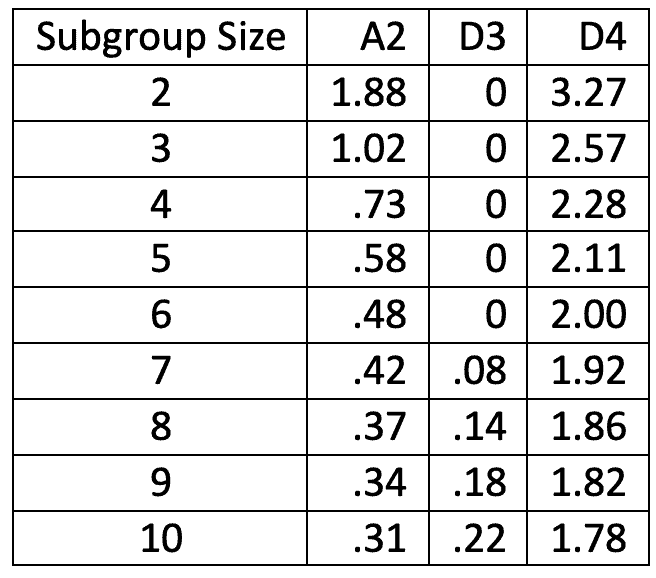
The A2, D3 and D4 factors change with sample size. An abbreviated table is provided here,

$-\bar{X}-$ and R Charts
Minitab was used to create the $-\bar{X}-$ and R charts. Minitab automatically adds the average and control limits, figure 3.

Figure 3
In the upper $-\bar{X}-$ chart, the averages are all contained between the control limits. There isn’t any indication of special cause. However, the lower R chart shows two sample groups, 6 and 18, are outside of the upper control limits.
How should we react to this new information? One possibility is to verify the original data. Was it recorded correctly, without error? If so, examine records for any process changes. Perhaps a new person was on the job? Were any inputs to the process changed? This could include materials, power supply, pneumatic air pressure, or other factors.
One does not automatically adjust the process. In this case, adjusting the average setting may push samples over the control limit, but the range variation may remain.
Decision Rules
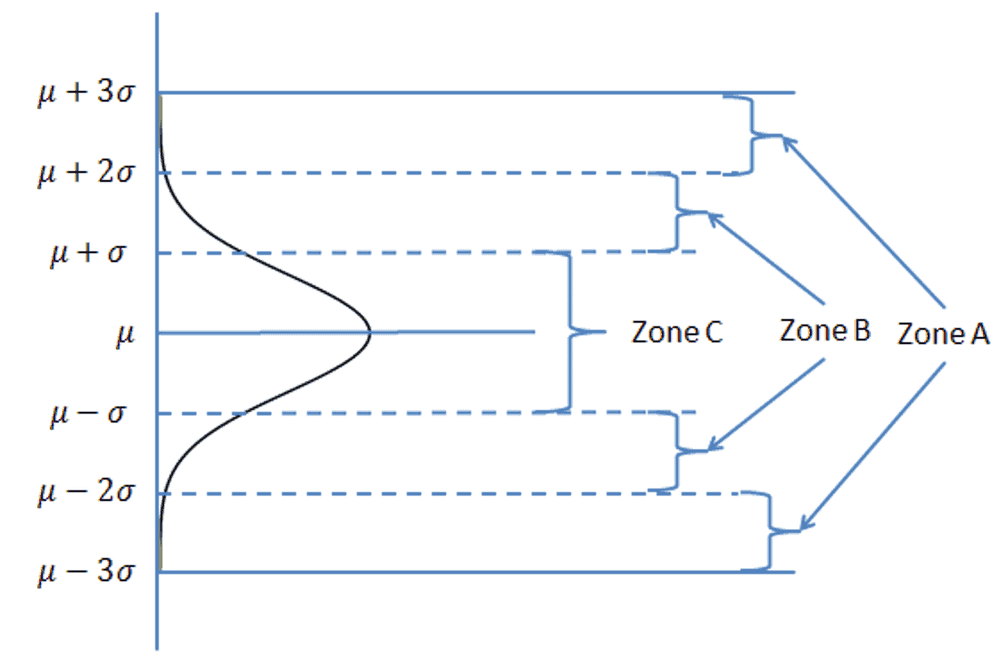
The above chart example used rule #1 of the Western Electric rules that flag the presence of a special cause of variation. To understand and implement these rules, zones about the centerline of the normal distribution need definition. Each zone is consists of two segments, each $-1\sigma-$ wide, figure 4.

Figure 4
The probability of a sample being beyond a 3 sigma limit is 0.27%; of being in zone A, 4.28%; of being in zone B, 27.18%; and of being in zone C, 68.27%.
The rules defining rare events are
- A single point beyond the control limits, on either side of the centerline. The total probability is about 0.27%.
- Two of 3 points in zone A or beyond, on one side of the centerline. The probability of being in Zone A, on one side, is 2.14%, plus beyond the control limit is 0.135, or a total of 2.275%. For two sides, the probability doubles to 4.55%.
- Four of 5 successive points fall in zone B or beyond, on one side of the centerline.
- Nine points consecutive points, on one side of the centerline.
These rules are applicable to the average chart because averages are normally distributed. While the range chart is non-normally distributed, rule #1 may be used when a range value falls out side of the control limits.
Conclusions
Scatter plots of the average and range can be converted to Average and Range charts with the addition of the chart grand average and control limits. The charts should be constructed when only common causes of variation are present. When the run rules are violated, the charts indicate the presence of special causes with a high probability. The 4 Western Electric rules may be applied to the $-\bar{X}-$ chart, but only rule 1 is easily applied to the R chart.
Note
If you want to engage me on this or other topics, please contact me. The first hour is so we can discuss your problem/concerns and to determine how I can help you. I want to solve your analysis, design, and manufacturing problems.
I have worked in Quality, Reliability, Applied Statistics, and Data Analytics over 30 years in design engineering and manufacturing. In Wayne State University, I taught at the graduate level. I also provided Minitab seminars to corporate clients, write articles, and have presented and written papers at SAE, ISSAT, and ASQ.
Dennis Craggs, Consultant
Quality, Reliability and Analytics Services
810-964-1529
dlcraggs@me.com
 Ask a question or send along a comment.
Please login to view and use the contact form.
We have read about SPC so we know about which chart (Range chart or Average chart) first prepare and why ??
Hi Yadavendra,
You know I’ve not thought about which to construct first. It really doesn’t matter much as you should consider both charts in the analysis. To calculate the limits for the X-bar chart, you do need the average range, R-bar, so doing a bit of calculation with the range chart is an early step.
cheers,
Fred
Hi Yadavendra,
I start with the Average chart first with the addition of the overall average. This allows me to look visually for trends in the Average. Assuming the process looks stable, the Average chart control limits requires information from the Range chart. Next, construct the Range chart to look visually for variation trends. Assuming there isn’t a trend to larger or smaller variation, the Range chart allows calculation of the Average Range, required to calculate an estimate of the standard deviation, the control limits on the Average chart, and the control limits on the Range chart.
PS: Sorry about the delayed response, but my family is going through some health issues. It was just yesterday that I read the emails that indicated you had a question.