Control charts provide an ongoing statistical test to determine if the recent set of readings represents convincing evidence that a process has changed or not from an established stable average.
The test also checks the sample to sample variation to determine if the variation is within the established stable range. A stable process is predictable and a control chart provides the evidence that a process is stable or not.
Some control charts use a sample of items for each measurement. The sample average values tend to be normally distributed allowing straightforward construction and interpretation of the control charts. The center line of a chart is the process average. The control limits are generally set at plus or minus three standard deviations (of the sample means – commonly called the sampling error of the mean) from the grand average.
When selecting a sub-group size, the intent is to collect samples that are as homogeneous as possible. The intent is to detect shifts between samples as the variation within a sample is relatively small.
One method is to select samples from the process as close together as possible. Another option is to randomly select from across a period of time or batch. The later option may have larger within sample variation, and not as sensitive to shifts in the mean as the first option.
A common sub-group size is 5 items. It is beyond the scope of this note to discuss determining the optimum subgroup size for your particular situation.
Measurements over time
Control charts are measurements over time. Charting the readings in production order or time order allows us to detect drifts readily. A simple control chart is just a chart of the readings over time. By grouping the readings into subgroups, it provides the benefits described above, yet are again plotted in order of production.
If building control charts after receiving the items from a supplier, ask for a means to determine the order of production. A serial number or indexing system may be all that is needed to determine the sequence of production.
X-bar and R control chart
The X-bar and R chart or Shewhart charts are the most common of the many types of control charts. These use a sub-group of items for each sample and plot on two charts the mean of the sample and the range of the sample.
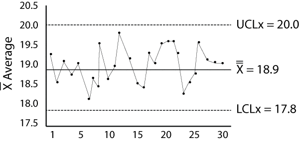
Here is a chart example:
The plotted points, X-bars, are the average of the sample with n readings,
n is the sub-group size
The center line labeled X-double bar Is the average of the sample averages
UCL and LCL are the upper and lower (respectively) control limits.
The sample readings are taken, averaged and plotted with a dot. The connecting lines are optional and may provide a easier way to interpret the data.
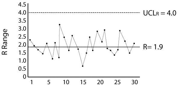
Here is an R chart example:
R is the range of the sample
The center line, labeled R-bar, ss the average of the sample ranges.
The y-axis should include a span of values suitable to include the or R values and provide a convenient way to plot and read the charts.
These two charts and others like them provide a graphical statistical test for process stability. Used correctly they provide the necessary feedback to allow for process improvement.
Related:
Variables Control Chart Background (article)
Chance of Catching a Shift in a Control Chart (article)
Selecting Control Charts (article)


 Ask a question or send along a comment.
Please login to view and use the contact form.
Nice summary job Fred.
Best, Randy Clark
Thanks Randy, much appreciated. cheers, Fred