A Weibull analysis is one of the most versatile tools in a Reliability Engineer’s toolbox. I have received many requests to start summarizing some of my articles and case studies into quick and easy PDF references for distribution.
[Read more…]CRE Preparation Notes
Prep notes for ASQ Certified Reliability Engineer exam ISSN 2165-8633
The CRE Preparation Notes series provides you with short practical tutorials on all the elements that make up the ASQ CRE body of knowledge. The articles provide introductory material, basics, how-tos, examples, and practical use guidance for the full range of reliability engineering concepts, terms, tools, and practices.
Keep your knowledge fresh by regularly reviewing topics and tools that make up reliability engineering.
Sign up for the CRE Preparation Notes email list for the new reliability engineering short tutorials.
- Improve your reliability engineering skills
- Learn about the wide range of tools available
- Enhance your resume with the ASQ CRE
You will find the most recent tutorials in reverse chronological order below.
SMART Reliability Goal
When working with a team creating a new system, I always ask, “what is the goal?” The answers often do not make much sense. The team using SMART reliability goals are astonishingly well-stated.
The difference that makes a goal, objective, or requirement practical and useful is summed up by SMART. A SMART goal is Specific, Measurable, Achievable, Relevant, and Time-bound. Let’s explore each element as related to a reliability goal.
[Read more…]The Informative Run Chart
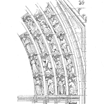
One of the very first plots to do with a string of data is a simple run plot. This plot provides information related to location, trends, patterns, and anomalies, The plot of the data over time is a rather informative chart.
You have most likely constructed many run charts; if not you really should. This short introduction to the run chart will cover creating and interpreting them. Plus we’ll mention a few cautions and tips, as well. [Read more…]
Stratification: A Basic Quality Tool
Stratification implies layers or differences. A quick test for soil composition is to place a sample of soil with water in a clear jar and give it a shake. The sand, silt and loam will settle at different rates and create a layered appearance within the jar over time. The height of each layer provides information about the proportion of each type of soil within the sample.
Stratification as one of the seven basic quality tools (some lists use a run chart or flowchart instead) the idea of layers or differences still applies. The idea is to identify potentially meaning differences within a sample set. [Read more…]
Creating a Histogram
A histogram is a graphical representation of a set of data. It is useful to visually inspect data for its range, distribution, location, scale, skewness, etc. There are many uses for histogram, there you should know how to create one.
Let’s explore a set of data and create default histograms using a variety of methods. If you have a way to create a histogram using some other method or software package please send it over and we’ll add it to the article. [Read more…]
t-test Hypothesis Testing for Means with Unknown Variance
In the situation where you have a sample and would like to know if the population represented by the sample has a mean different than some specification, then this is the test for you. In this case, you do not know the actual variance of the population, you just have a sample.
This test is often the second one in a textbook that describes hypothesis testing. It is a useful hypothesis test and applies in many situations as we rarely know the population variance. [Read more…]
Tips for Better Online Learning
One of the key ideas behind the ASQ CRE certification is the need to learn enough to pass the exam. Then you are expected to continue to learn to maintain your certification. It is the key idea of ongoing professional development that central to the CRE program, and many other certification programs.
Over this past year of COVID-induced restrictions, the ability to attend local chapter meetings or conferences has changed. While many events are now done online, it’s another Zoom meeting after a day full of such online meetings.
A recent article by Anant Agarwal, the founder and CEO of edX titled, “What I’ve Learned About Learning – 5 Hacks for Success” caught my attention. Anant provides a few tips to improve your online learning – and I would say any learning. A little research on how to best learn online also found “Tips for Successful Online Learning” that helped inform this short summary. [Read more…]
Building a Basic Box Plot
One of the first things to do when faced with a set of numbers is to plot them. A histogram is often the first choice, maybe a dot plot. Up your data plotting skills and let your data provide a bit more information by using a box plot. [Read more…]
Introduction to the Delphi Method
As reliability professionals, we are in the business of estimating or forecasting the reliability performance of our product, equipment, or system. While we use a range of tools to analytically make these estimates, sometimes we do not have sufficient data or information.
One method is to ask another person that has knowledge of the particular technology, use conditions, or whatever is hampering our work. If you ask two people you most like will get two different answers. If you ask 10, 10 different answers.
One way to work with a group of subject matter experts is to conduct a structured communication technique called the Delphi Method. [Read more…]
What-if Analysis
What if you knew all the possible outcomes for your product’s reliability performance due to component variations, for example? What if you knew the future with enough certainty to make a difference?
Building on brainstorming, what-if analysis involved using models or prototypes that allow you to change something and see how it alters the output or performance. What if we change this support bracket from iron to aluminum? What if we swap out this 100 ohm resistor for a 200 ohm one?
As a curious engineer you could spend many, many hours conducting what-if based experiments, so there is a bit more to this idea then just a random walk of changes. [Read more…]
Creating a Dot Plot
Graphs contain information and often tell a story. Our interpretation of the graphic can be aided or hindered by the design or style of the plot. Cleveland and McGill (1984) studied graphical perception and found the use of dot plots to aid viewers to understand the data’s message clearly.
The nature of a dot plot is like a bar chart, yet without the bars. Less ink, just a dot to indicate count or position along an axis permits conveying information simply. Due to its simplicity, it also permits adding additional information useful for comparisons or spotting trends, and more. [Read more…]
Building and Using Pareto Charts
You may have heard of the 80/20 rule. The idea is that 80% of the wealth is held by 20% of the population. As an Italian economist, Vilfredo Pareto made this observation that became generalized as the
Pareto Principle: 80% of outcomes are due to 20% of causes
For field returns, for example, we may surmise that 80% of the failures are due to 20% of the components, for example. This principle helps us to focus our work to reduce field failures by address the vital few causes that lead to the most, or most expensive, failures. [Read more…]
Beware of the Type III Error
There is a type of error when conducting statistical testing that is to work very hard to correctly answer the wrong question. This error occurs during the formation of the experiment.
Despite creating a perfect null and alternative hypothesis, sometimes we are investigating the wrong question. [Read more…]
Sample Size for Hypothesis Testing of μ
A common question when setting up a hypothesis test is concerning sample size. An example, might be: How many samples do we need to measure to determine the new process is better than the old one on average?
While this seems like a simple question, we need a bit of information before we can do the calculations. I’ve also found that the initial calculation is nearly always initiated a conversation concerning the balance of sample risks, the ability to detect a change of a certain size and the constraints concerning the number of samples. [Read more…]
The Power of a Sample
We use a sample to estimate a parameter from a population. Sometimes the sample just doesn’t have the ability to discern a change when it actually occurs.
In hypothesis testing, we establish a null and alternative hypothesis. We are setting up an experiment to determine if there is sufficient evidence that a process has changed in some way. The Type II Error, $-\beta-$ is a measure of the probability of not concluding the alternative hypothesis is true when in reality it is true.
The power, $-1-\beta-$, reflects the ability of the sample to correctly lead us to the conclusion that an actual change has occurred when in reality it actually has. [Read more…]