Accessibility improves clarity for everyone. The Communicating with FINESSE® Accessibility Checklist is a practical tool to make technical presentations and reports accessible to individuals with visual and hearing impairments. The checklist is part of the broader FINESSE framework—an acronym for Frame, Illustrate, Noise Reduction, Empathy, Structure, Synergy, and Ethics—designed to help technical professionals communicate more effectively with senior decision-makers.
Three pervasive communication barriers are accessibility, language, and generational differences. Addressing accessibility is the first big step, and arguably the most important, for knocking down all three barriers.
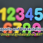
This article highlights why accessibility matters in technical reports and presentations. It includes 12 tips from the FINESSE Accessibility Checklist.
From the Real World
“I really appreciate you getting me an advance copy a week in advance,” said Charlie, the manufacturing company’s regional manager, to me in front of everyone.
That makes you feel good when you are young. That’s especially true after the way I pushed hard on our internal staff in a resource-constrained, small consulting company.
Things didn’t get uncomfortable until the second time Charlie asked me to lead a presentation from our firm. It was definitely something above my pay grade at the time, and I had two senior technical leaders who were envious.
There was speculation that I had some kind of family ties to Charlie, or maybe he just liked having someone he could push around.
Charlie made a comment to one of them that he really liked my PowerPoints, which were simply designed and had fewer details.
“You tend to gloss over the important stuff and not tie him down,” said Kirk to me one day. “You and Charlie will both learn your lesson one day.
After several months and my fourth or fifth presentation to Charlie and his team, I found myself one-on-one with Charlie in his office.
“I like your straightforward writing style,” commented Charlie.
‘Well, my secret is I let my wife read them,” I candidly replied. “She knows nothing about what we do, but if she can halfway understand it, I know I am on the right track.”
“I do the same thing,” said Charlie. “Between you and me, I don’t read very well. I never have. But I got through high school and four years of college. It was tough.”
“Well, you must read better than most,” I said, primarily because Charlie was 20 years my senior and clearly an accomplished business leader with the confidence of a major manufacturing company. “And clearly you are both smart and accomplished.”
He smiled. We moved on to more of the business issues of the day.
Charlie and I never talked about it again over the decade we worked together. I never knew why he “didn’t read very well.” But I did know he liked getting those reports and PowerPoint presentations in advance so that he could absorb them.
Later, I would more formally learn about accessibility and conclude that it’s not about “why” you make things accessible to someone but rather the “what” you do to make them more understandable for all.
The FINESSE Accessibility Checklist
The CWF Accessibility Checklist breaks accessibility into manageable pieces, typically focusing on 3 to 5 key aspects for each section to improve clarity for the entire audience.
The foundational aspects include:
Visual Cues & Color
Moving beyond color-only meaning. It emphasizes using symbols, shapes, and patterns to represent ideas so that the information remains clear in grayscale or for those with colorblindness.
Contrast
Ensuring high contrast between text/symbols and their backgrounds to maintain readability for those with low vision.
Structure & Headings
Using built-in slide layouts and unique titles for every slide. This allows screen readers to navigate content in a logical order.
Alternative Text (Alt Text)
Providing descriptive text for images and tables so that visual data is accessible to those using assistive technology.
Readability
Using sans-serif fonts (like Calibri or Arial) at large sizes (minimum 36–44 pt for headings) to ensure visibility during projections.
Empathy-Based Design
Shifting the mindset from “checking a box” to understanding the audience’s experience, acknowledging that an estimated 8% to 25% of business leaders may have some form of visual or hearing impairment.
Two Helpful Tips from the Checklist Elements
There are 26 items in the checklist. Here, I provide two tips from each category as helpful reminders.
Colors
Use black, dark blue, or dark green as primary color(s).
https://www.communicatingwithfinesse.com/post/use-these-colors-to-convince-a-decision-maker
Use paired colors with high contrast (lightness and hue).
Symbols
Check high contrast ratios for each symbol.
Consider using text with symbols.
https://www.communicatingwithfinesse.com/post/most-icons-are-not-universal-so-add-a-helpful-word
Fonts
Use sans-serif fonts with a high x-height (e.g., Aptos, Calibri, Helvetica, Tahoma, Verdana).
https://www.communicatingwithfinesse.com/post/three-sleeper-fonts-that-create-powerful-presentations
Use standard, larger font sizes appropriate for text, headings, and PowerPoint slides.
Alternative Text
Alt Text should convey the message, not what’s in the picture.
Alt Text should be provided with each table.
Tables
Use headers (don’t just bold the text) in the tables in Microsoft Word.
How to treat your tables in PowerPoint (or Excel)
https://www.communicatingwithfinesse.com/post/do-merged-cells-create-better-tables-in-excel
General
Someone with a visual impairment should provide input during the final review.
Mark the report or presentation as “Draft Final” if accessibility checks are incomplete.
https://www.communicatingwithfinesse.com/post/use-draftfinal-until-the-accessibility-checks-are-done
Being More Effective
Addressing accessibility is the first big step, and arguably the most important, for knocking down the three barriers of effective communication–accessibility, language, and generational differences. An estimated 8% to 25% of business leaders have some form of visual or hearing impairment, so it’s important to make your message resonate with them. More importantly, accessibility improves clarity and understanding for everyone.
This article originally appeared on Substack.
Solomon, J. D. (2026, March 25). The FINESSE accessibility checklist removes a pervasive communication barrier. Substack. Read article.
JD Solomon champions practical communication skills that help technical professionals convey complex ideas clearly and confidently. Need help getting started? Visit his company’s website, www.jdsolomonsolutions.com.

Leave a Reply