
Imagine you are not feeling well and you go to a doctor. When you sit down in the doctor’s office, he doesn’t even look at you. Instead, he has a book opened on the desk and starts reading it aloud. You sit there without being examined, listening to a list of medicines, activities, exercises and diet changes. The doctor then looks up and says that you need to do all of them. Take all the medicines. Change all your activities. Start doing all the exercises. And completely change your diet.
You ask if the doctor is going to examine you at all. He says no – he doesn’t need to. You see, the book he is reading from is a standard document that has recently been published by a group of selected experts about making you healthy. By doing all the things the book says, you are by definition ‘healthy.’ And cured.
Crazy right? So why do we take this approach to so many of the things we drive, devices we use and services we pay for?
This is the fourth article in series that deals with reliability and safety of emerging technologies. It was inspired by my recent involvement in helping some small satellite manufacturers wrestle with the challenges of operating in an industry that is conditioned to deal with older, larger and more expensive satellites. And size does matter.
The previous articles of this series focused on the folly of compliance, where we revert to a set of standardized activities we make the design team do. But this compliance approach does not work, if by ‘working’ we mean making things as safe and reliable as they could be. Compliance frameworks have failed to prevent nuclear, shipping, transportation, energy and space craft disasters. We need to stop focusing on what the design team does and start focusing on what the system does. In other words, migrate toward a performance-based framework.
This article essentially examines the problem of going to the doctor with a specific sickness but being treated for all possible ailments as it applies to a product or system. When it comes to improving reliability, you need to know what is causing failure. We need to analyze reliability performance to then know what to do.
We will move onto a basic reliability analysis of small satellites. Without knowing why your system fails, you have no idea what you need to do to make it more reliable. But first, we need to look at some basic reliability concepts.
A Reliability Primer
Many engineers (including those involved in the satellite industry) will routinely say that there is not enough information or data to help us know what we need to make our device more reliable. This is often complete nonsense. Testing is often necessary to identify key reliability drivers for a specific product. But there is typically a wealth of knowledge you can tap into to guide you on your first steps toward reliability improvement.
Without having to conduct any additional tests and reviewing published papers and documents, we can conclude that virtually all (small) satellite data analyses routinely demonstrate one thing:
Satellites that fail, small or otherwise, either fail to deploy or suffer ‘infant mortality’ failures.
This is a BIG conclusion that is enormously helpful. Why? Because we have just eliminated potentially hundreds of ‘reliability fixes’ that will have no reliability benefit. Worse still, these useless fixes have the potential to make reliability worse by making the system or product more complex.
To better understand what satellite data tells us, we need to have some understanding of reliability and how it is modeled. So we need to first examine some basic principles of reliability – and we will do this based on the knowledge that satellites either fail to deploy or fail due to infant mortality.
Hazard Rates and Bathtub Curves
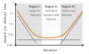
You have probably heard of the ‘bathtub’ curve which describes different regions of reliability performance. The bathtub curve is illustrated below and describes different types of hazard rates throughout the operational life of a system.
Typical bathtub curve
The bathtub curve (contrary to widespread opinion) is regularly observed in reliability analyses – if we relax our opinion on what a bathtub curve should be shaped like. We often see a ‘tick’ or ‘check marked’ shaped bathtub curve instead of the smooth, symmetrical shape illustrated above.
The reason the bathtub curve appears in varying degrees in reliability discussion and teaching is that the different regions emanate from different failure mechanisms. ‘Region I,’ ‘infant mortality’ or ‘wear-in’ failure mechanisms typically emanate from things like manufacturing defects. They do not include the gradual accumulation of damage. If you want to do something about infant mortality, you do things like improve manufacturing quality, introduce software fault tolerance and reduce system defects.
Conversely, ‘Region III’ failures involve the accumulation of damage. These are ‘wear-out’ failure mechanisms that are strictly within hardware domains (not software). For small satellites, this would include radiation damage, thermal cycling fatigue and corrosion associated with oxidizing agents.
‘Region II’ doesn’t involve manufacturing defects or wear-out. Constant hazard rate failure mechanisms typically emanate from external shocks or stresses that immediately cause failure. For example, tires are punctured by debris on a road at a constant rate. It does not matter how old or new the tire is, it is still just as likely to be punctured when it is driven over certain road surfaces. Of course, tires wear-out as well. But this applies to a separate failure mechanism – not the failure mechanisms associated with something like a nail puncturing the tread for which tire age has no relevance.
For satellites (and electronic systems more broadly), we often see electronic components fail at a constant hazard rate due to things like ‘dirty’ power supply. If voltage spikes occur at a constant rate, then the electronic components they destroy also fail at a constant rate.
We are better at modelling and understanding Region II and III failures than Region I failures. This is because we can apply a ‘physics or logic of failure’ approach. Scientific knowledge helps us understand how a nail punctures a tire. We can perhaps model how many nails we expect to see on a road. We can also apply scientific knowledge to understand how the same tire ‘wears out.’ We can perhaps conduct a study to examine how much rubber a tire loses for every mile it is driven on particular roads at particular speeds. We can combine these sources of knowledge to create a robust model of Region II and III reliability.
What we cannot easily model are the mistakes that a manufacturer or technician makes when producing or installing the tire. And because we struggle to model this phenomenon, we often don’t. This is a problem that is discussed later.
Region 0 – Dead on Arrival (DOA) and Deployment Failure
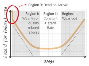
The one thing that the bathtub curve illustrated above does not model is the probability that a system is ‘dead on arrival (DOA).’ DOA goes beyond infant mortality – it means the system was never in an operational state. This includes a satellite that fails to deploy. Satellite DOA failures can emanate from transportation or degradation in storage, or a lack of system level integrated testing before launch to identify interface issues.
DOA rates are often used in reliability engineering. It is possible for failures associated with deployment mechanisms to effectively manifest themselves in the same way DOA failures do. For this article, lets also call DOA and deployment failures as ‘Region 0’ failures. They are just as significant as any other. Region 0 is illustrated in our updated bathtub curve below. This sees us add a ‘vertical cliff’ to the first part of our bathtub curve.
Bathtub Curve with Region 0 or ‘Dead on Arrival’ Hazard Rate
Mathematically speaking, the value for the hazard rate at zero usage is described by αδ(t) at t = 0 where δ(t) is the Dirac delta function and α is the probability that a satellite will be DOA. Don’t be put off by this sentence – it is only included here to appease the nerds among the readers! And we do have a couple of equations later on that technically need this Dirac delta function.
Region I – How do we model infant mortality?
Infant mortality involves a system whose conditional reliability is improving. That is, surviving older systems become more reliable as they age. The is because infant mortality specific failure mechanisms are ‘removed’ from the overall population as they are repaired. When these defects manifest themselves as failures, they are not just repaired – the defects are removed.
Why are they removed? Because these failure mechanisms are not supposed to exist. So as they are removed the system becomes more reliable. Because of this, infant mortality is associated with things like manufacturing errors that create a system that is not ‘baseline.’ And we gradually ensure all systems don’t have these defects because they would have failed if the did, or they have these defects removed through repair.
There is substantial information within our collective knowledge about infant mortality failure. And this knowledge is drawn from many fields.
Reliability growth testing (RGT) helps us quantify and model how reliability grows from one developmental prototype to another. A prototype is tested in operational conditions until a failure occurs. That failure cause is removed from the system through redesign. The prototype is tested again until the next failure occurs and so on. RGT is a particular form of ‘infant mortality’ – albeit applied at the design stage of system development.
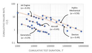
In the early 1960s, a trend started to emerge. An engineer called J.T Duane was working on GE Jet engines and was keeping track of how reliability improved from one RGT phase to the next. He published a paper in 1964, which included a plot of prototype cumulative failure rates versus RGT duration. The trend in his paper is illustrated below when plotted in ‘log-log’ axes.
Historical cumulative failure rates for various reliability growth programs by materiel system category (Duane 1964)
What is very clear are the straight lines that describe the decrease in the failure rate, or the increase in reliability. There is only one probability distribution which replicates this linear, scaled observation: the Weibull distribution. A full description of what the Weibull distribution is and how it works is outside the scope of this article. Suffice to say the Weibull distribution is commonly used in reliability engineering because it can describe infant mortality and wear-out failure trends. It also has some other properties.
The Weibull distribution statistically mimics the act of removing successively likely failure mechanisms as it is from the family of ‘extreme value’ distributions. That is, it models the ‘first’ or the ‘highest’ random variable value from a sampled set. This is analogous to the ‘first’ failure, or the one with the ‘highest’ apparent failure rate that is the first to manifest. So the Weibull distribution makes perfect sense for anyone who is not interested in modelling all potential failures – but someone who is interested in the first.
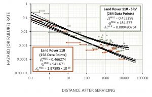
We see this trend in other applications of infant mortality. A study was undertaken to investigate the post-servicing hazard rates of Land Rover 110 vehicles that were then used by the Australian Army. The results of the analysis (for two groups of vehicles) are illustrated below.
Rate of Occurrence of Failure After Servicing (ROFAS) for Australian Army Land Rover 110 vehicles
The trend is very clear: the hazard rate follows a decreasing straight line when plotted on ‘log-log’ axes in the same way reliability growth improves. For the Special Reconnaissance Vehicle (SRV) set, which is the top line in the figure above, you can see the hazard rate start to ‘flatten out’ as it approaches Region II.
So how is this analogous to small satellite infant mortality? Whenever we service a system, we take a previously functional vehicle and do something to it with the intent of eliminating future wear-out failures. But every time we ‘touch’ something, there is a finite chance that maintainers will introduce their own defects. And because we are now talking about defects, we see the same slope or straight line in both previous illustrations. Defects are being removed during Region I, and we get precisely the same characteristic regardless of whether we are dealing with reliability growth or post-servicing maintenance induce failures. It is all about removing defects.
This means we can confidently assume that Region I failures for any system are modeled by the Weibull distribution – from the perspectives of both theory and data. We should only ever model infant mortality with any other model if (and only if) there is a compelling reason to do so based on a physics-based analysis of small satellite failure. But this is extraordinarily unlikely.
The Weibull Distribution
To continue this discussion, we do need to examine the Weibull distribution – but only a little bit. The Weibull distribution is described by two parameters: the shape parameter (?) and the scale parameter (?). The scale parameter is expressed in the same units as the random variable (such as days if the random variable is time to failure.) The unitless shape parameter controls the nature or behavior of the distribution.
If the Weibull distribution is used to model time to failure, the shape parameter defines whether the failure is subject to infant mortality, has a constant hazard rate, or is caused by wear-out. If the shape parameter is less than one, infant mortality is the dominant type of failure. If the shape parameter is greater than one, wear-out is driving failure. If the shape parameter is equal to one, the hazard rate is constant.
The slopes of the lines in the two figures above are also the shape parameters for the underling hazard rates with Weibull intensity. Any time we model the process of removing defects we tend to see Weibull shape parameter values range between 0.3 and 0.5. And this range more than coincidentally is observed in virtually all published small satellite reliability analyses.
Modelling for DOA and Infant Mortality
We will (perhaps unfortunately) now dig a little deeper into the mathematical characteristics of the Weibull distribution. This is primarily aimed for those readers who may want to understand how we can model systems that have both ‘Region 0’ (or DOA) and ‘Region I’ failures.
To do this, the ensuing probability density function (PDF) which describes the relatively probability of failure with respect to time becomes:
where ? is the probability that the small satellite will be DOA, δ(t) is the Dirac delta function, ? and ? are the shape and scale parameter respectively for the Weibull distribution that describes the subsequent infant mortality failures.
The second part of the equation above is a scaled version of the Weibull PDF. The corresponding reliability function (which returns the probability that the small satellite is functional at time ?) is:
Without starting to analyze data, we know how to model small satellite failure based on theoretical statistical knowledge. Unless a physics-based analysis of small satellite reliability allows us to draw alternate theoretical conclusions, we need to use the equations above for subsequent reliability analysis.
So We Know Small Satellites either Fail to Deploy or Suffer Infant Mortality
Returning and expanding on our previous proposition:
Satellites, small or otherwise, either fail to deploy or suffer ‘infant mortality’ failures.
Small satellites exclusively fail due to Regions 0 and I failures only.
How do we know this? Data.
There is only one satellite reliability analysis that takes into consideration DOA probability and infant mortality. This analysis suggested that 18.5 per cent of small satellites fail in ‘Region 0.’ That is, almost 1 in 5 are DOA. And the analysis suggested that the Weibull shape parameter that describes the failure of small satellites that launched successfully is around 0.48 – recalling that any value less than 1 means that failure is driven by infant mortality.
Virtually all other models used in published small satellite reliability analyses don’t include ‘Region 0’ or DOA failures. Thy just use an unmodified Weibull distribution. What this forces the analysis to do is assume that ‘Region 0’ or DOA failures are ‘really early Region I’ failures. This would obviously skew the results, making infant mortality to appear to be even more pronounced.
So do we see this in the analyses that discount ‘Region 0’ failures? Absolutely.
The highest value for the Weibull shape parameter returned by any analysis was 0.54. This study made certain conservative assumptions regarding data interpretation. But other analyses that discount DOA failures show that the Weibull shape parameter to be around 0.32. Similar studies put this figure closer to 0.38. Regardless of approach or assumptions, the Weibull shape parameter is clearly less than 1, meaning that satellites that deploy adequately exclusively fail due to infant mortality.
And this article would not be complete without a critique of some other approaches. There a couple of analyses which try and fit the model to the data better. This involved creating a ‘Frankenstein’ distribution which is a convoluted combination of two Weibull distributions. The problem this ‘Frankenstein’ distribution stops being a Weibull distribution. And we know from the analysis above that we should be using a Weibull distribution.
Other analyses are amateur at best. For example, a 2009 analysis looked a subset of ‘large’ satellites for which it has only two data points. It used a five-parameter model to describe failure! If you want to see how not to do reliability analysis, look at the ‘MEO Category’ of figure 5 in the analysis. This is crazy statistics. You can fit virtually any model to observed data by throwing more parameters into it. But this does not help – particularly if there is no physical basis for these parameters. And in this case, the horrific reliability curve this created stopped going ‘down’ once it approached 96 per cent. It was effectively saying that once a satellite gets beyond a certain age, it will never fail. And this is in a peer reviewed journal!
So while the data is out there, and analyses published, they are not all good. The lesson that must be learned is that no matter what, you have to be smart enough to review what has been stated before you use it to design your multi-million dollar product
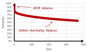
To simplify this discussion, the data from valid published analyses results in an indicative small satellite reliability curve (considering DOA probability) in the figure below.
Small Satellite Reliability Curve
Small satellites tend to average less than 200 days in orbit. This means (based on the reliability curve in the figure above) we would expect the average small satellite to have around a 20 per cent chance of DOA failure, and a 15 per cent chance of infant mortality failure.
What about other satellites?
As long ago as 1995, analyses were being published that showed how virtually every satellite and spacecraft that successfully deployed, regardless of size and era (dating back the Magellan, Voyager and Mariner probes) failed due to infant mortality. The extent to which ‘Region I’ failures drive reliability is most prominent in small satellites. A 2010 analysis identified that (for some reason) satellites with a mass greater than 500 kg do not exhibit the same level of infant mortality as smaller satellites. And we know from the discussion above that around 20 per cent of small satellites are DOA.
Wear-out is only (partially) observed in large satellites whose mass exceeds 2 500 kg, but the (overwhelming) majority of their failures still occur in ‘Region I’ of the bathtub curve. The most reliable satellites tend to be medium satellites with mass between 500 kg and 2 500 kg. Perhaps this is because medium satellites are not subject to the budget and schedule constraints that small satellites are and are not burdened with the complexity of large satellites.
Other Satellite Characteristics?
A 2014 paper suggests that mechanisms and structures (M&S), thermal control systems (TCS) and telemetry, tracking and command (TT&C) modules contribute the most to infant mortality of small satellites. Another curious metric (as it relates to reliability) is mass. Small satellite reliability decreases as mass increases. For example, the industry average 1 kg CubeSat time to failure is 85 days. This decreases to 22 days for 4 kg CubeSats. There may be a tendency for small satellites to have become ‘even smaller’ over time. This means the ‘first’ small satellites were heavier, and perhaps less reliable as they were the ‘first.’ While outside the scope of this article, analyzing this trend will most likely be useful to better help us understand the root causes of satellite unreliability.
There have been some other trends which are not immediately intuitive. Small satellite reliability in general has not improved from 2000, but this may be explained by new manufacturers entering the market with limited initial satellite production experience. Infant mortality has generally decreased slightly, perhaps because we are starting to better understand how these satellites work.
And So What?
To summarize what we have learnt about small satellites, around 20 per cent fail due to ‘Region 0’ or DOA failures, and 15 per cent fail due to ‘Region I’ or infant mortality failures for a typical mission duration. This means that if we want to improve reliability, we should probably focus on making these satellites more robust for the transportation and launch phase and improve manufacturing quality.
But is this what we see in the industry? No.
What we see is a compliance framework that seems to focus on anything but these types of failures. And it is these compliance frameworks that new players in the satellite industry (including small satellite manufacturers) are being subject to.
So these manufacturers are being told to invest precious time and resources in addressing failure mechanisms that are simply not happening. This will almost certainly take focus away from the true sources of failures we have just identified. It will also mean the customer pays more for a product that is still unreliable.
The next article in this series looks at this issue for the satellite industry and tries to understand why this phenomenon repeats itself across many domains. If you are an experienced engineer, regardless of industry, you could probably relate to this issue. That is, a bunch of compliance tasks that were written in a bygone era or by experts who don’t know your system as well as you do that need to be complied with. No wonder you can’t meet your reliability goals.
And the reason this experience is common is because of human nature. And human nature is essentially at the heart of what we talk about next time.
 Ask a question or send along a comment.
Please login to view and use the contact form.

Leave a Reply